Client —
Jaunt (ongoing personal venture)
Client —
Jaunt (ongoing personal venture)
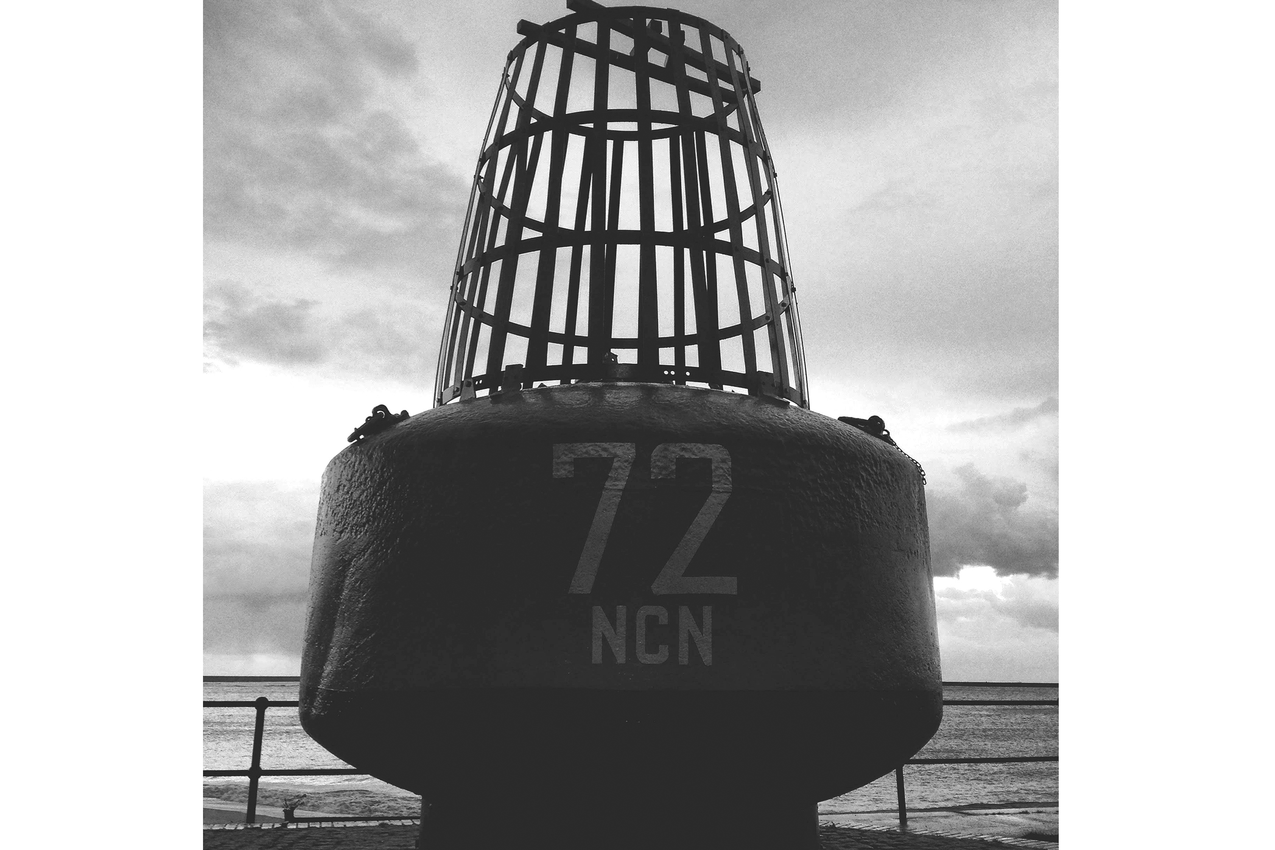
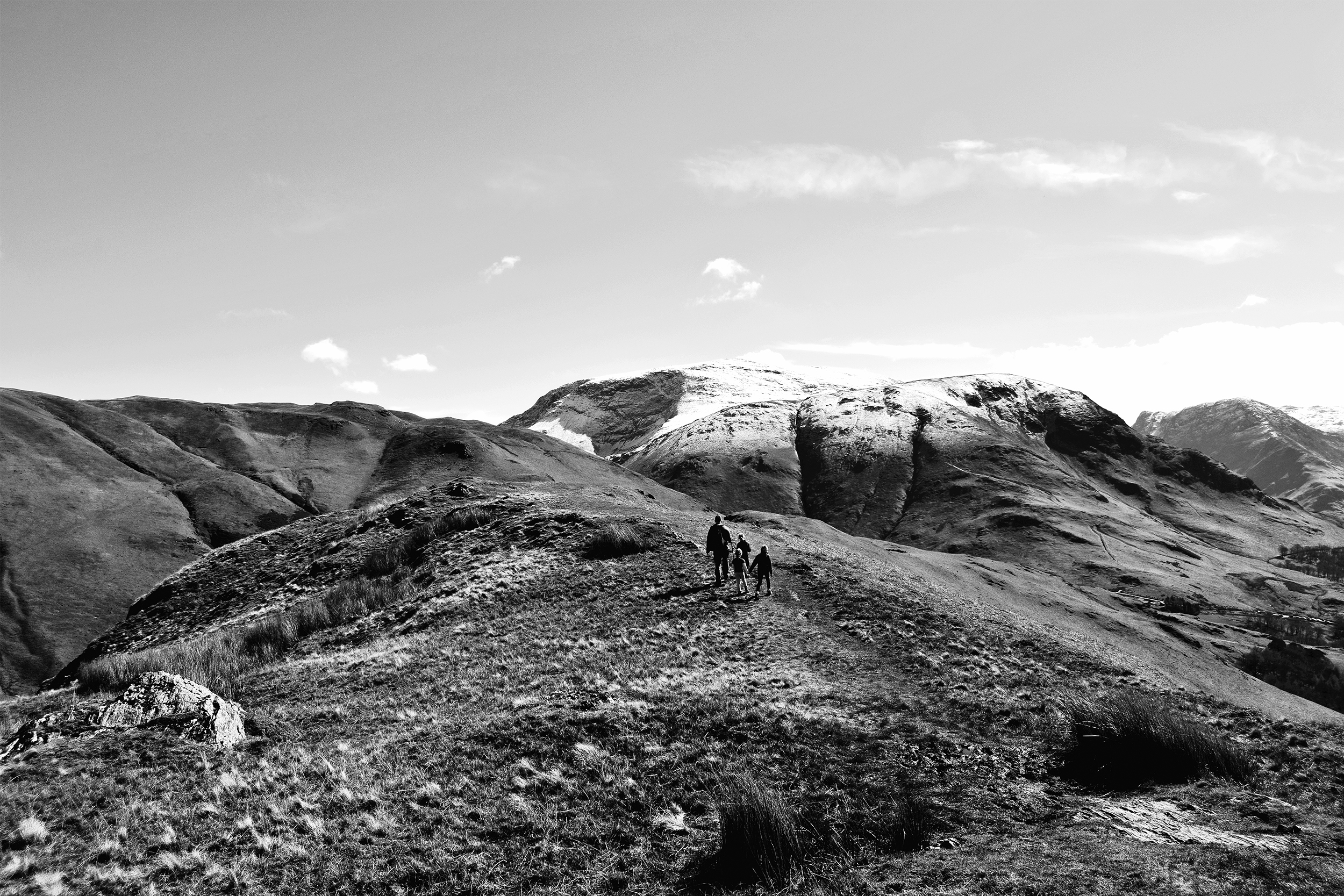
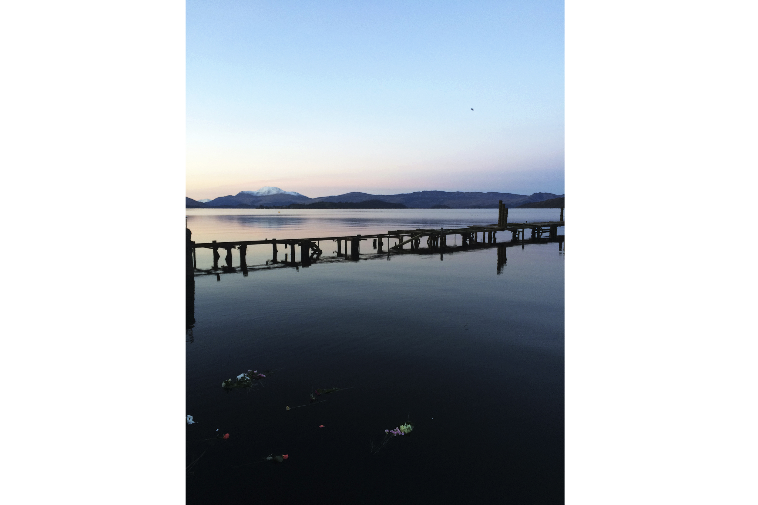
'Jaunt ’a short excursion or journey made for pleasure.’
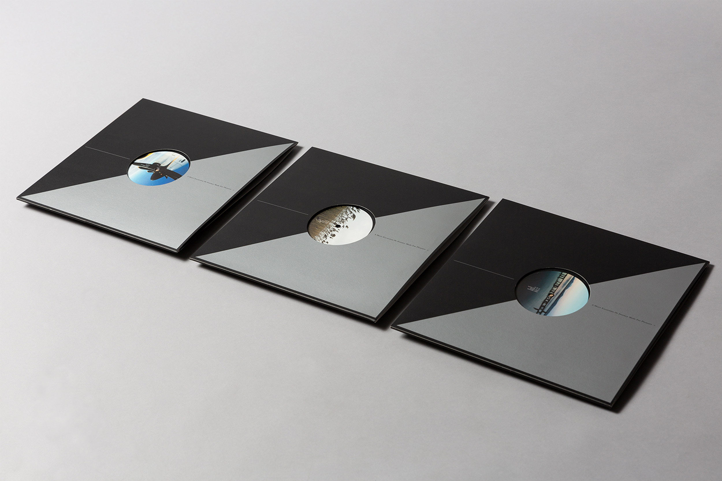
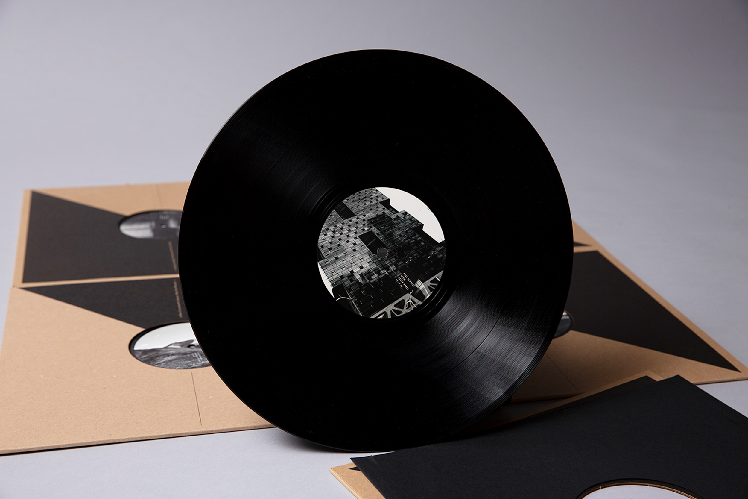
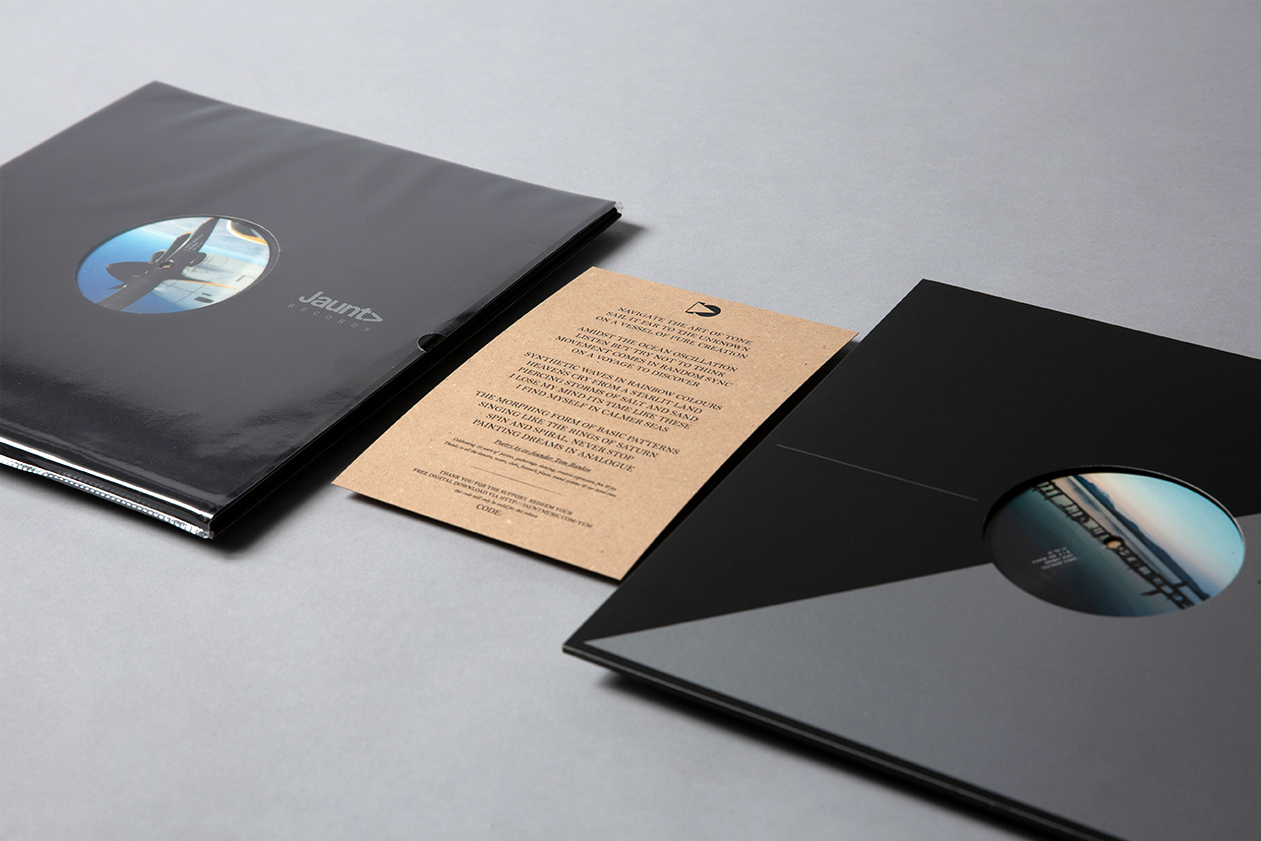
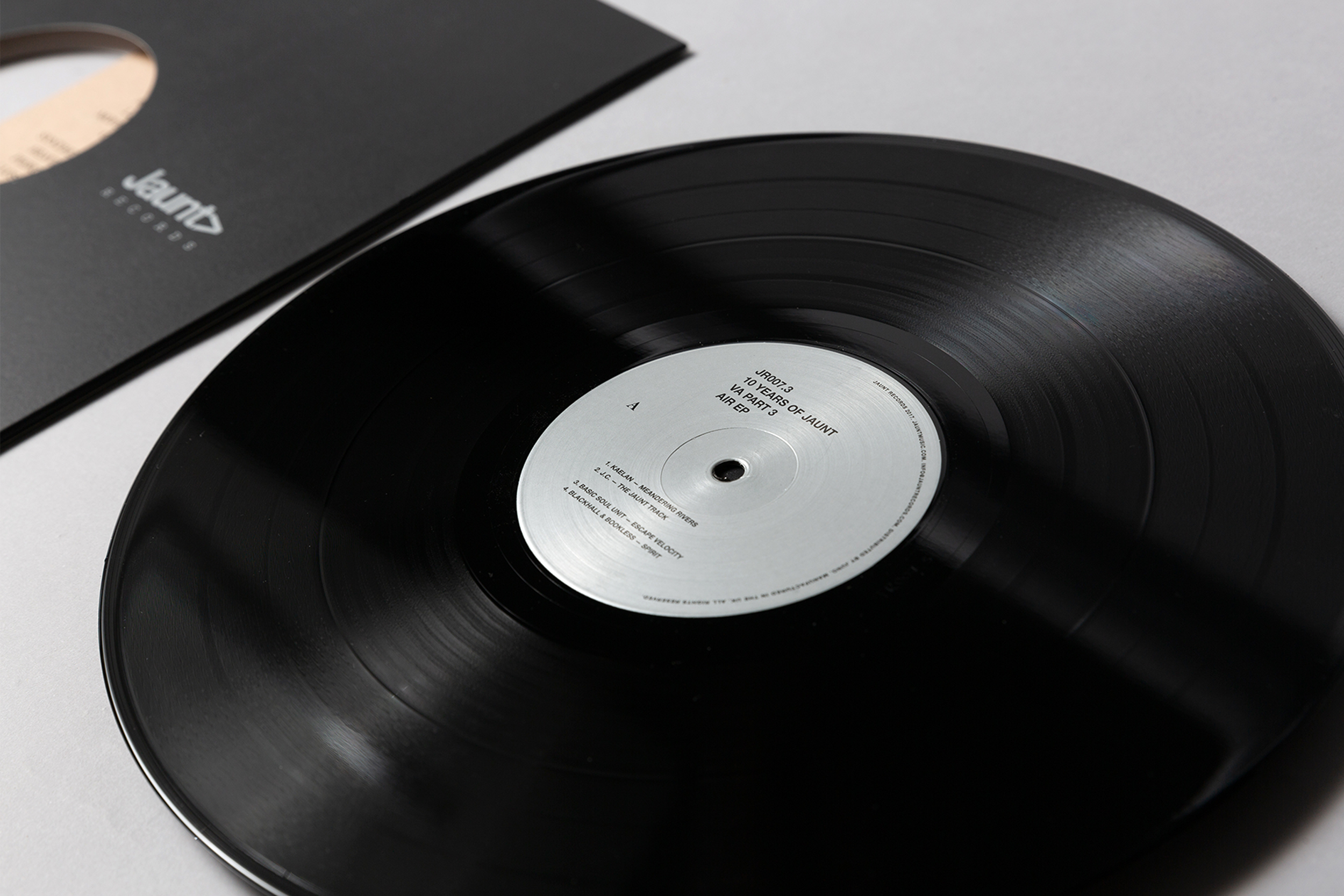
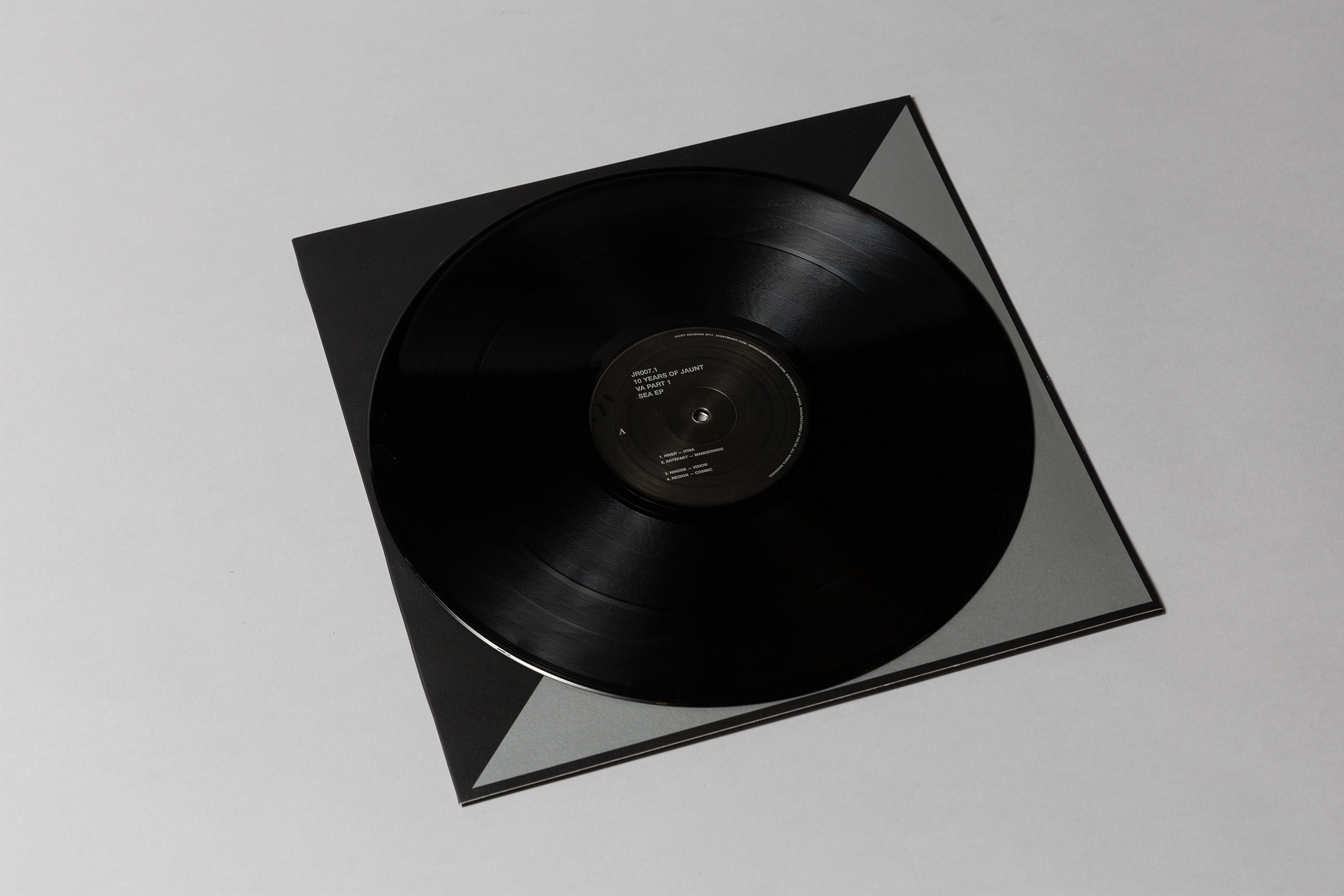
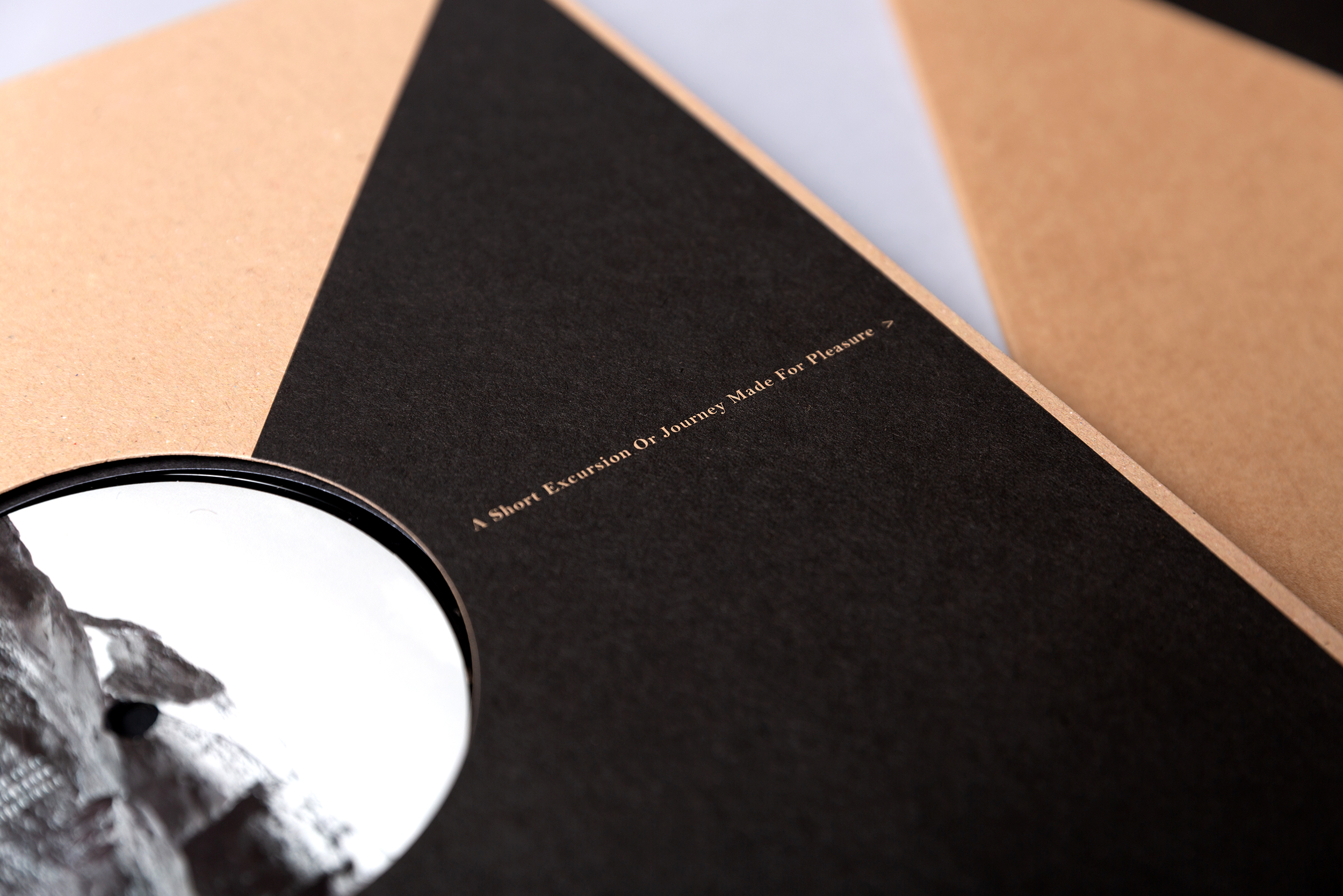
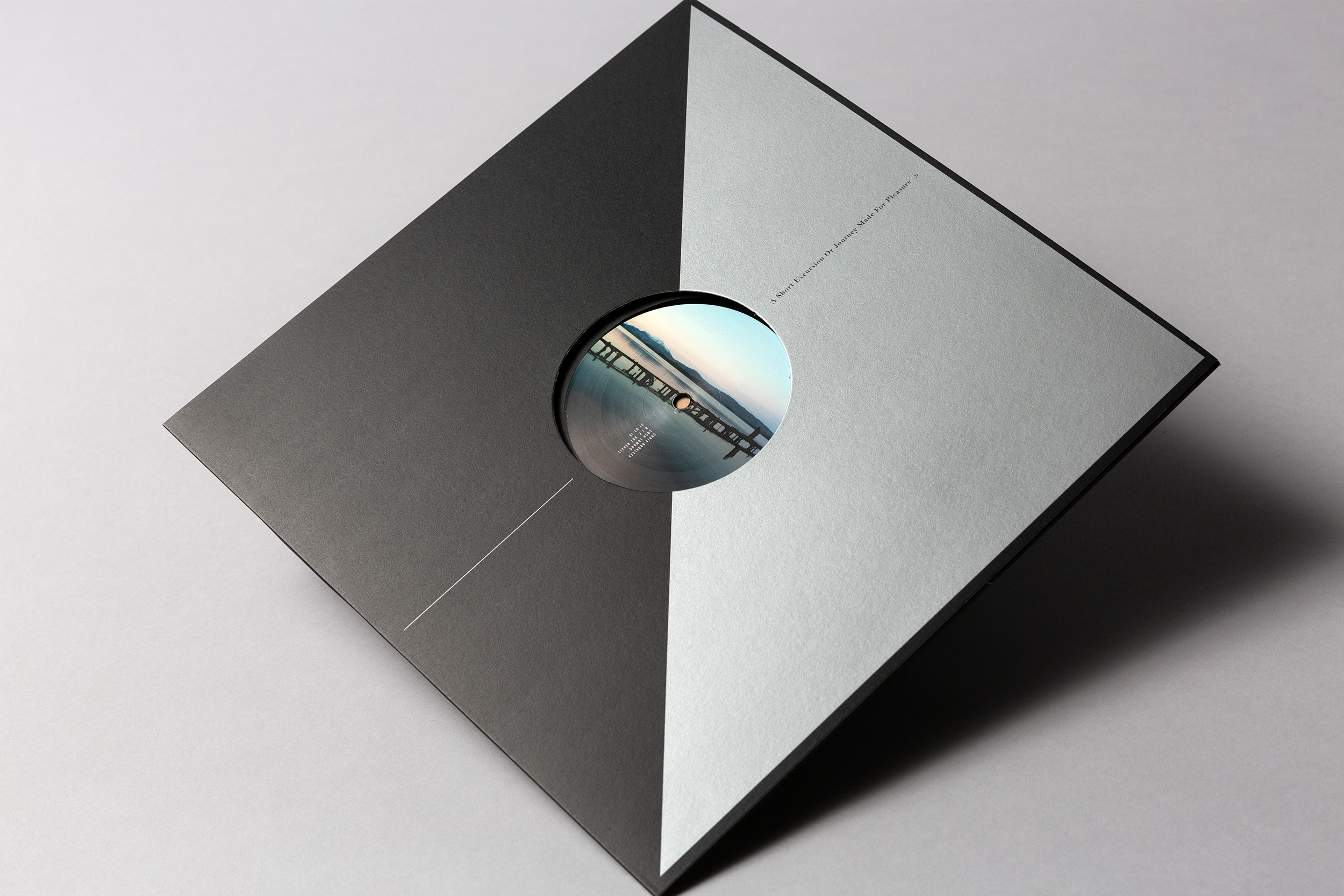
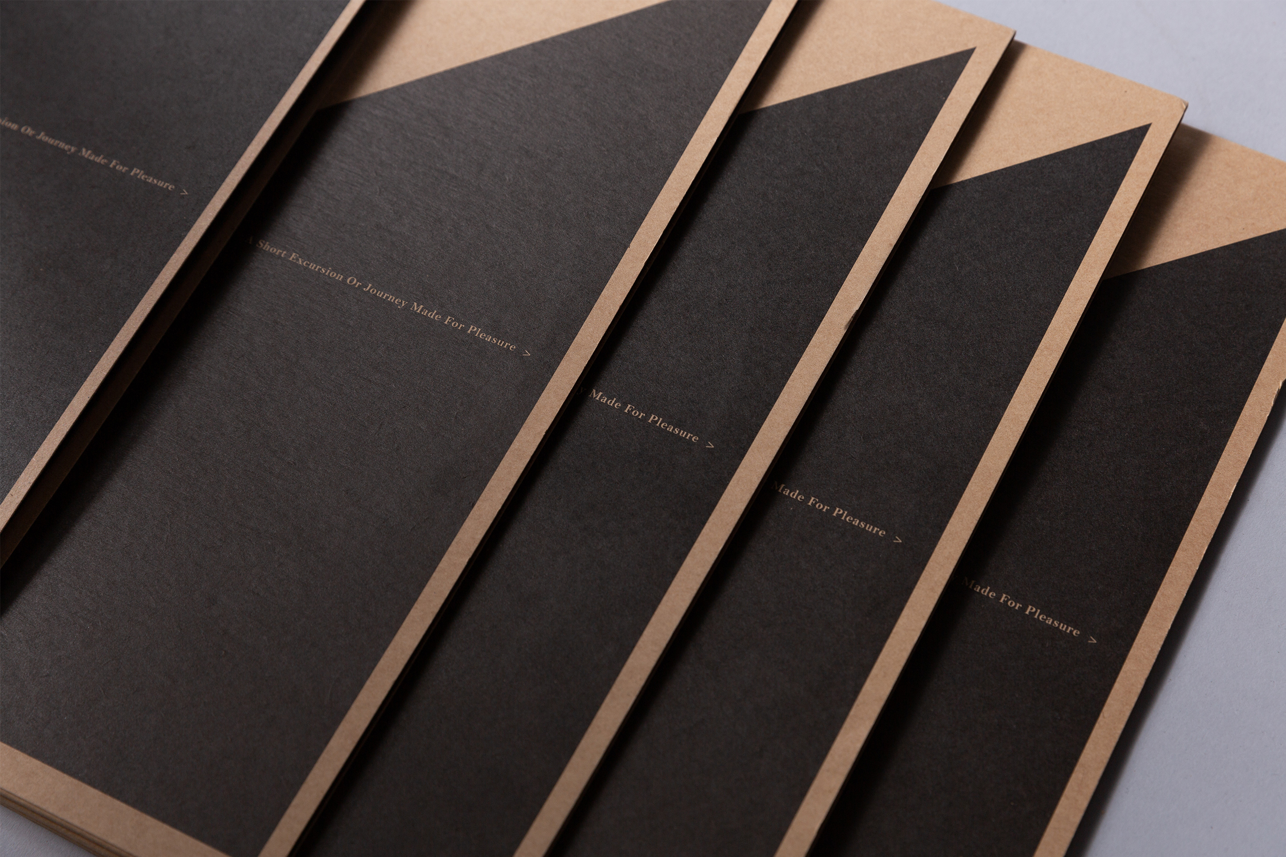
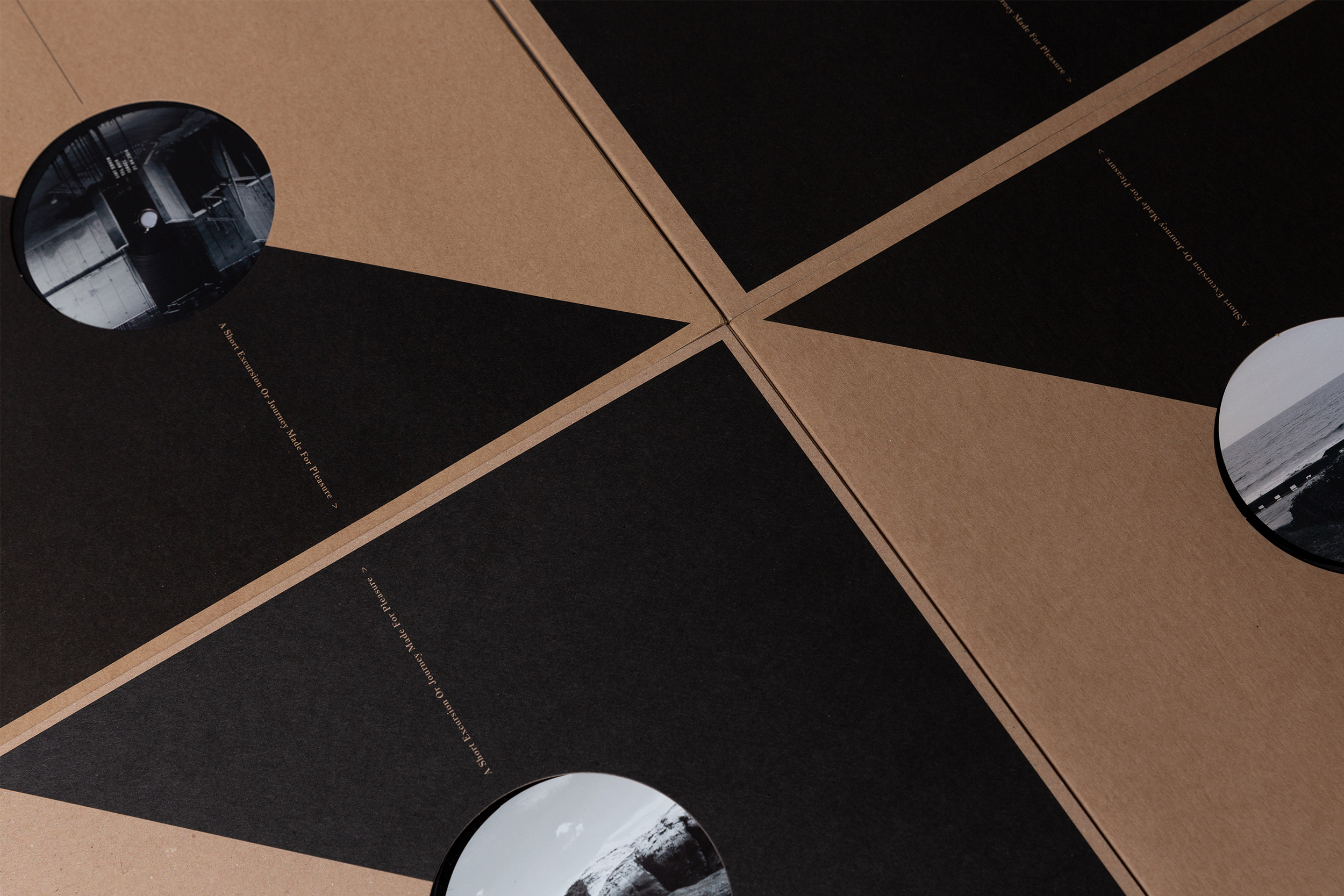
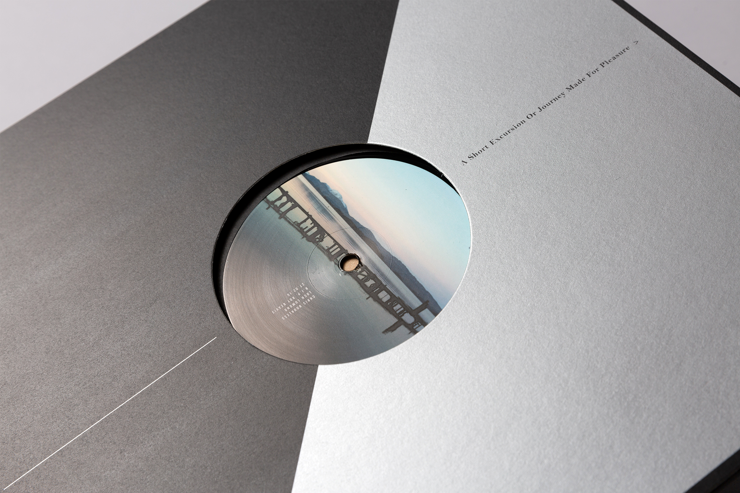
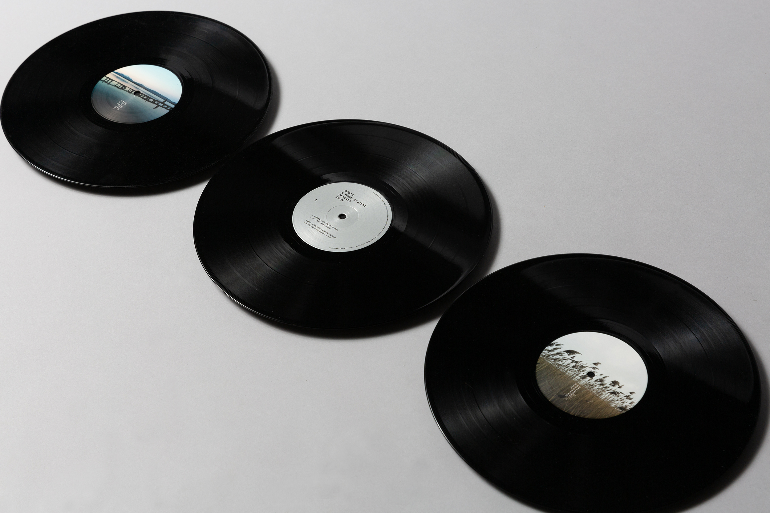
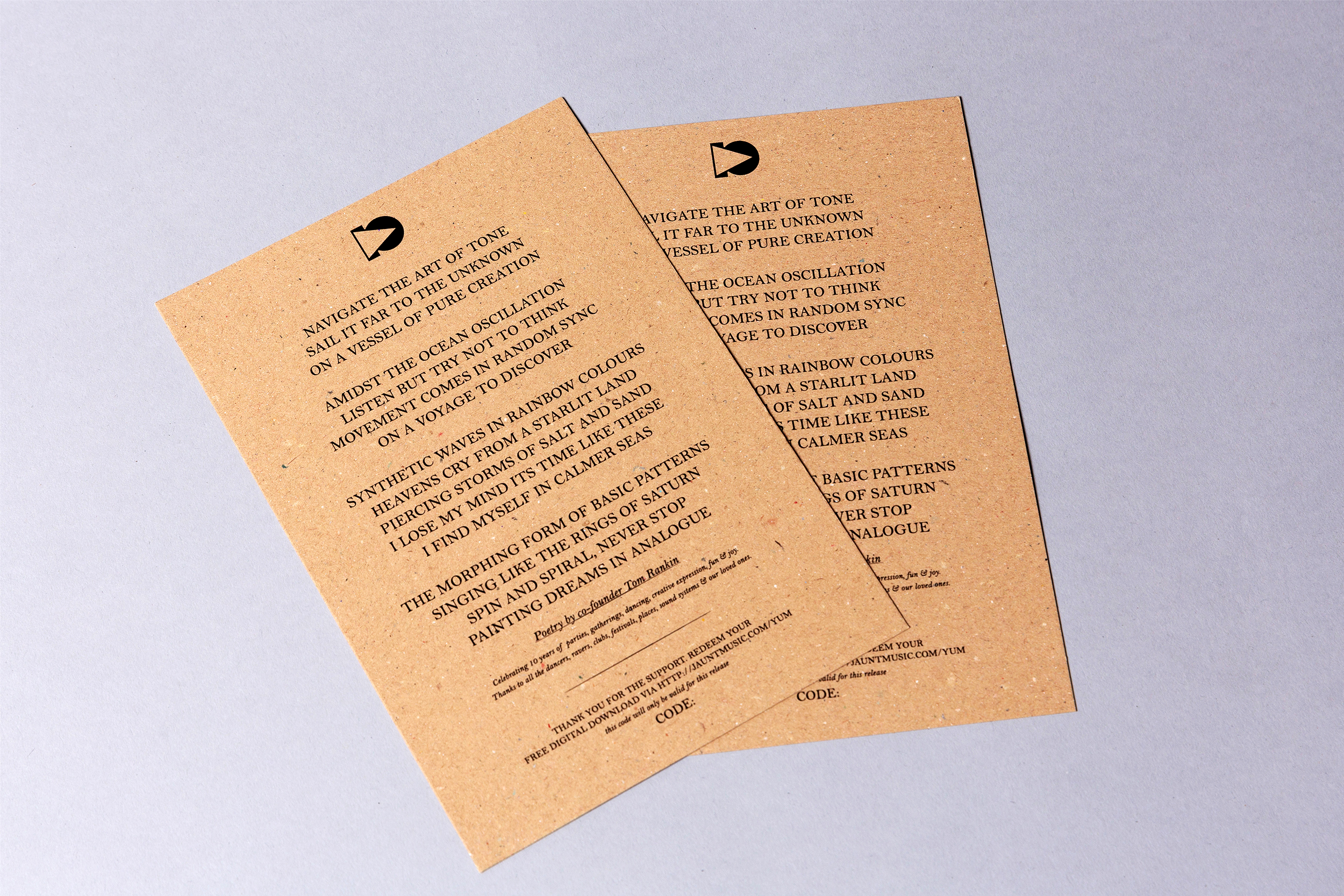
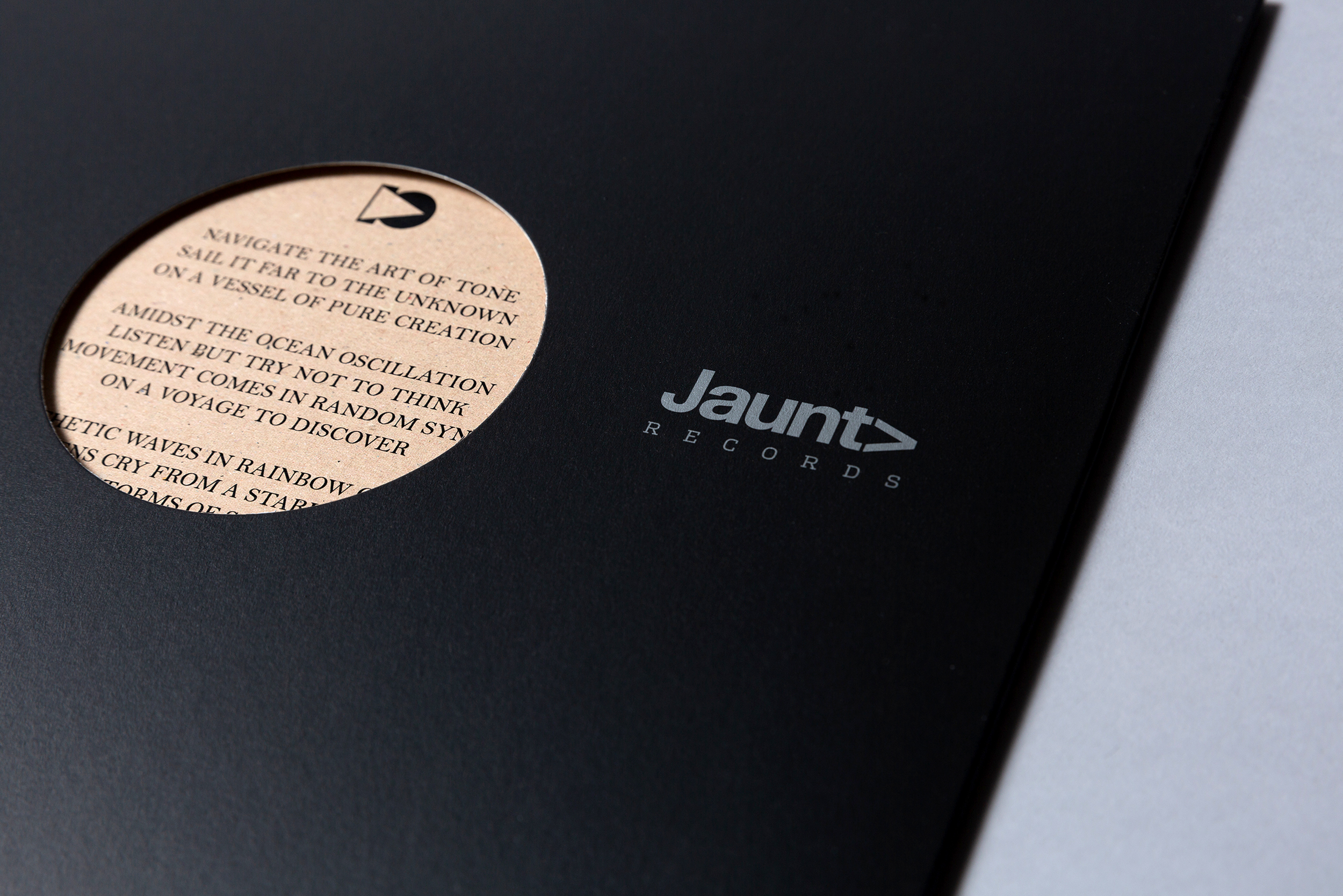
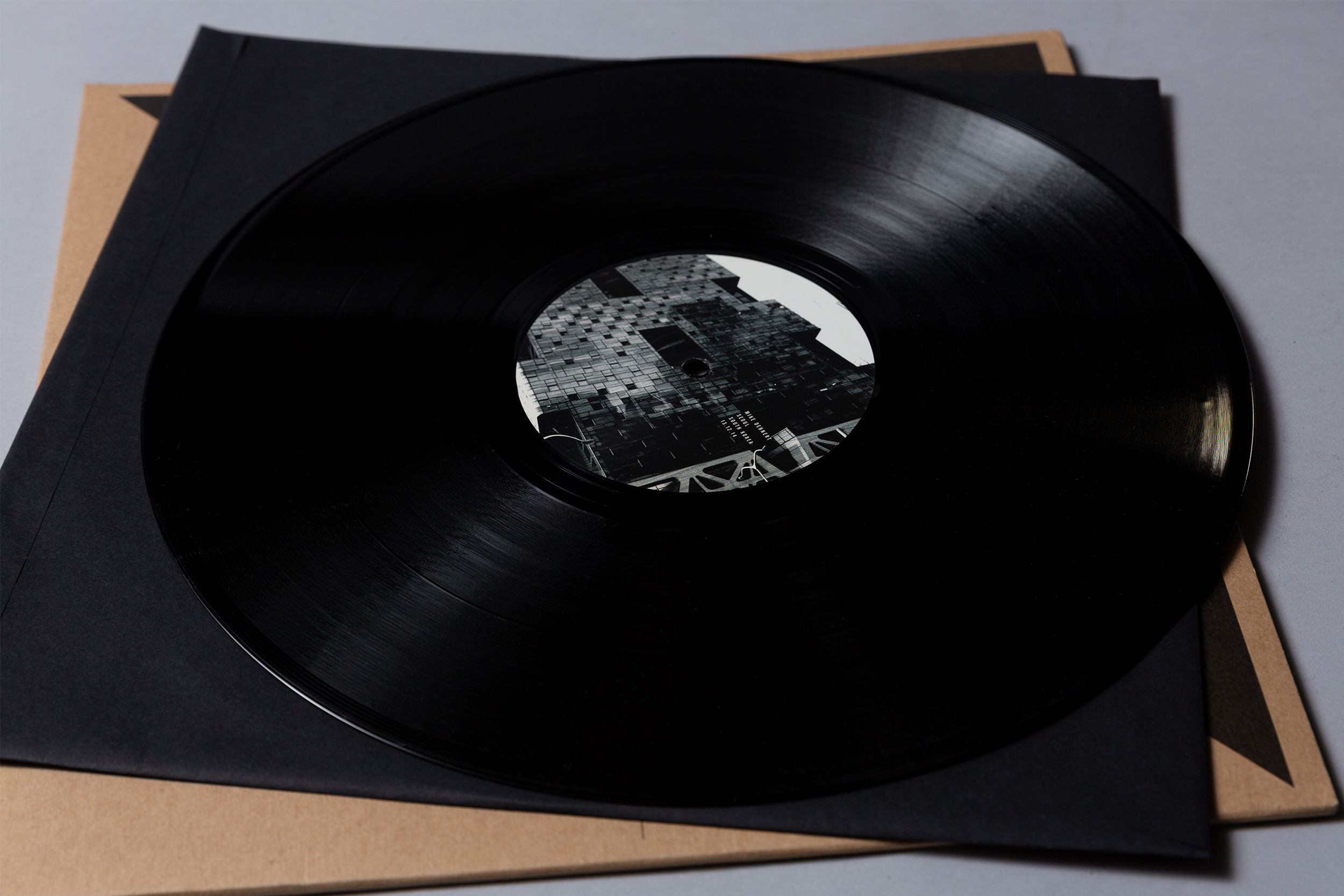
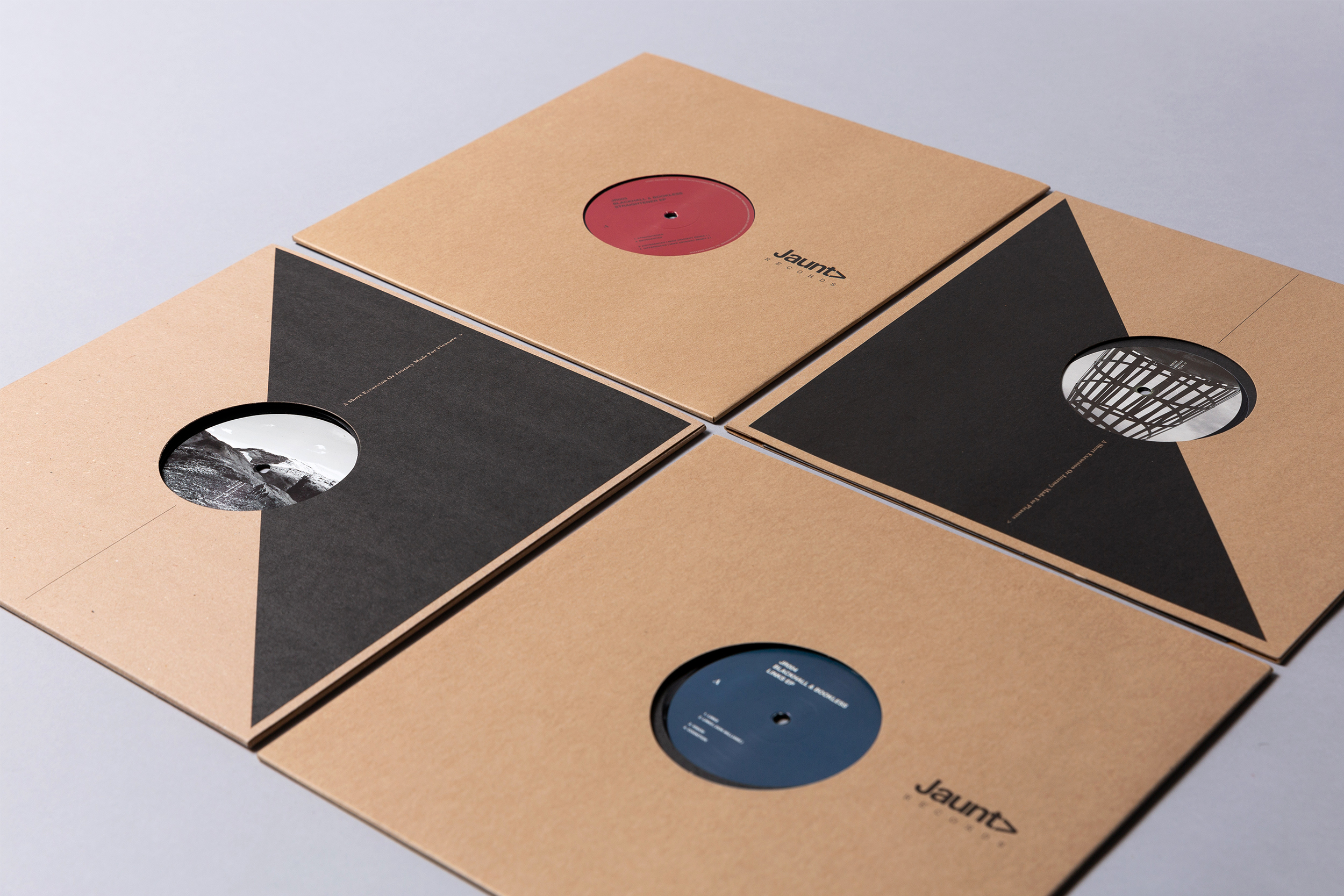
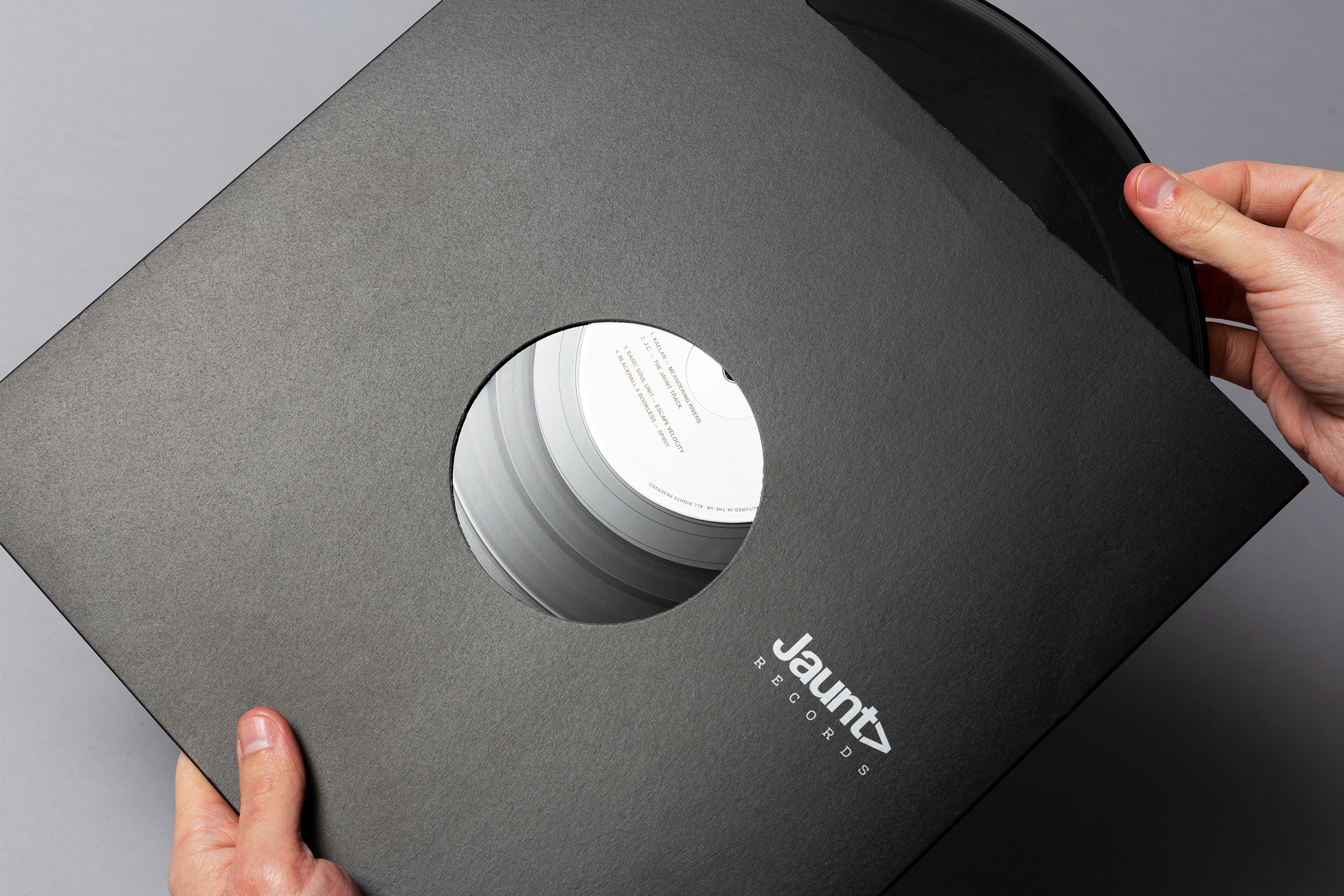
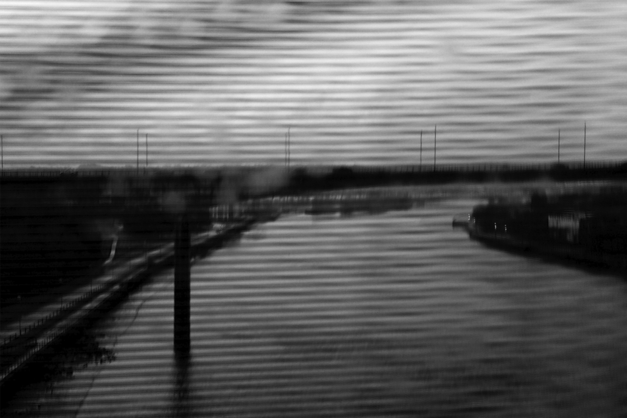
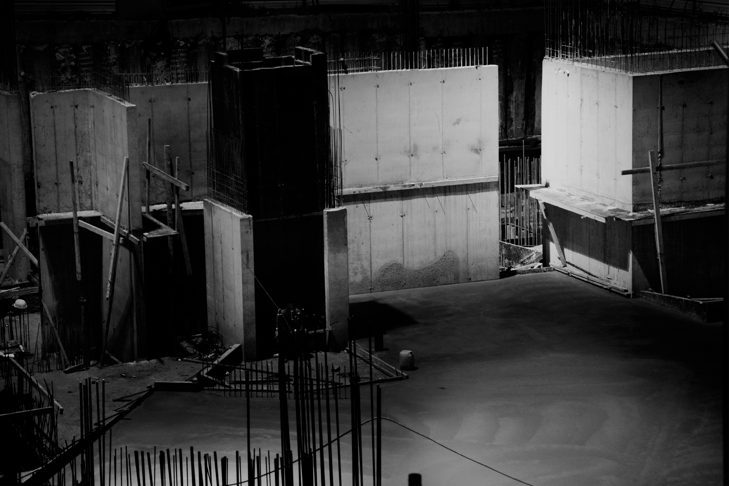
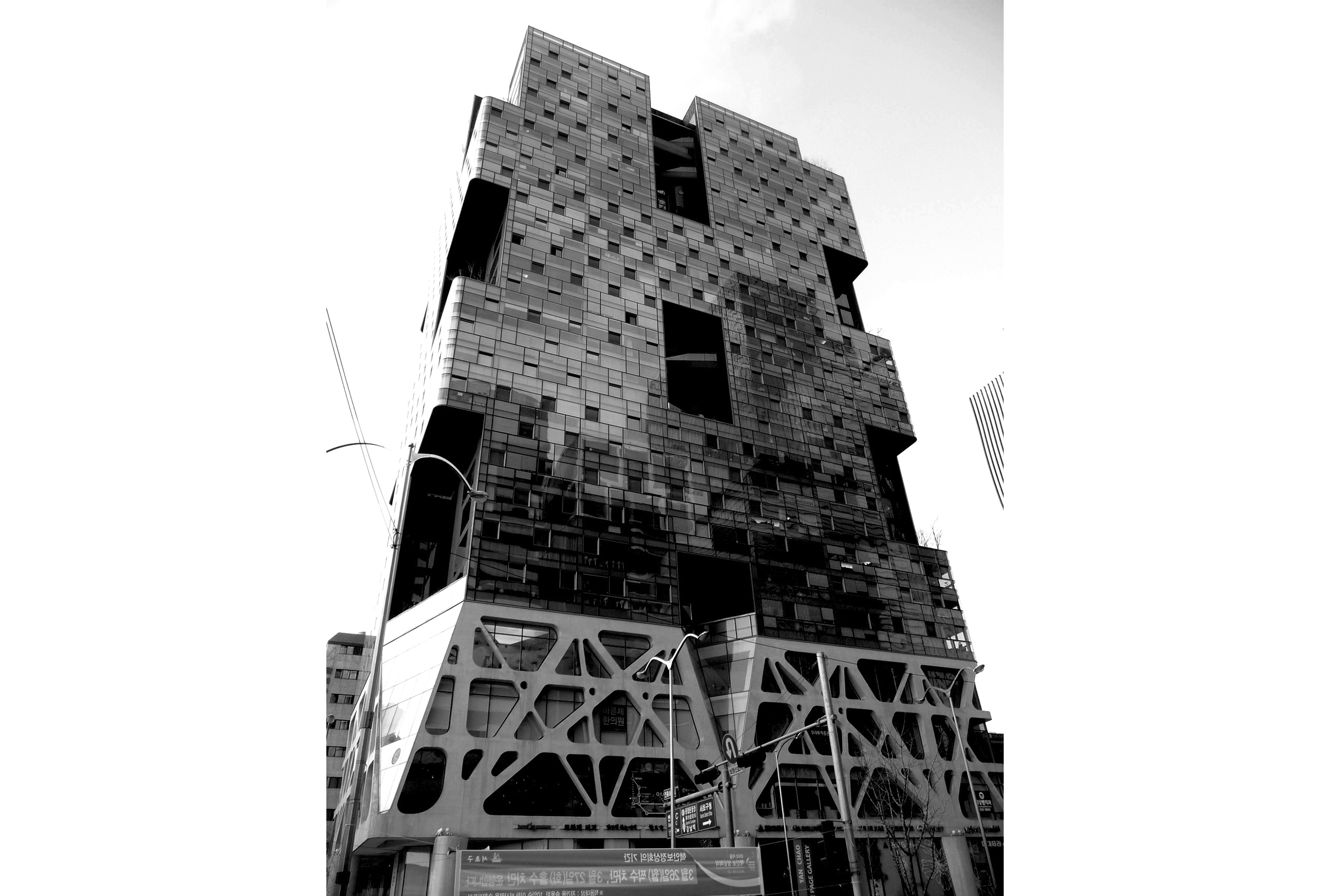
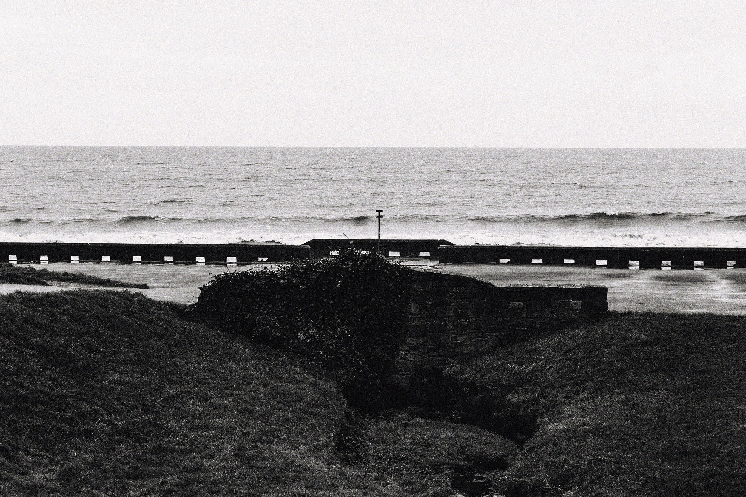
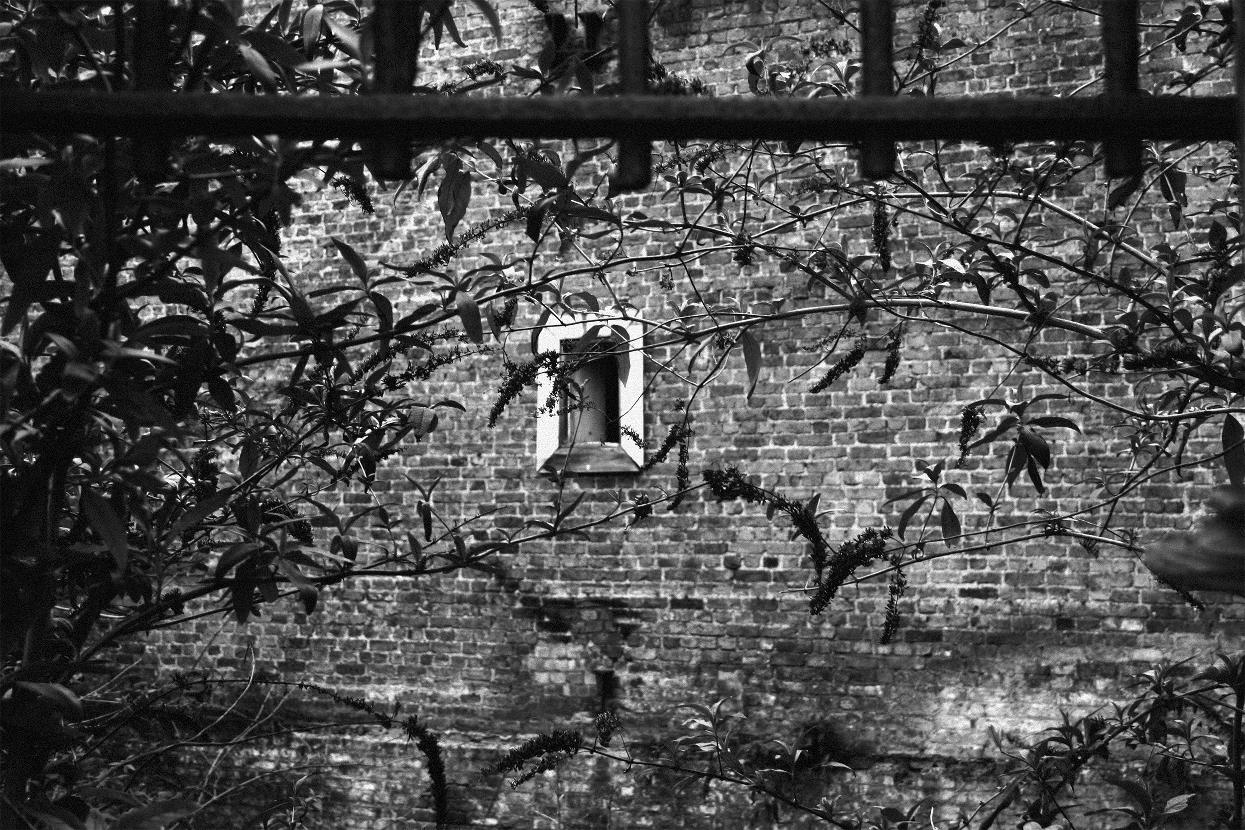
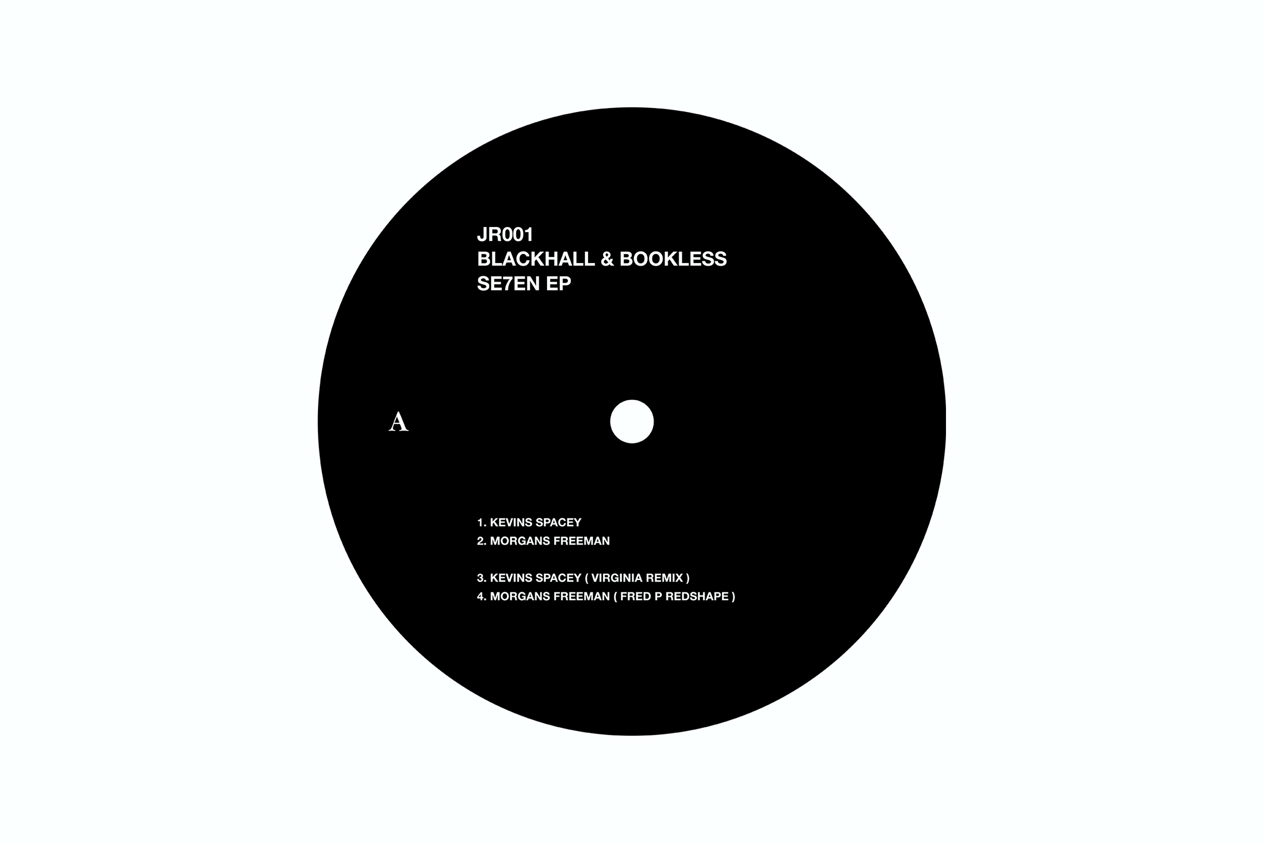
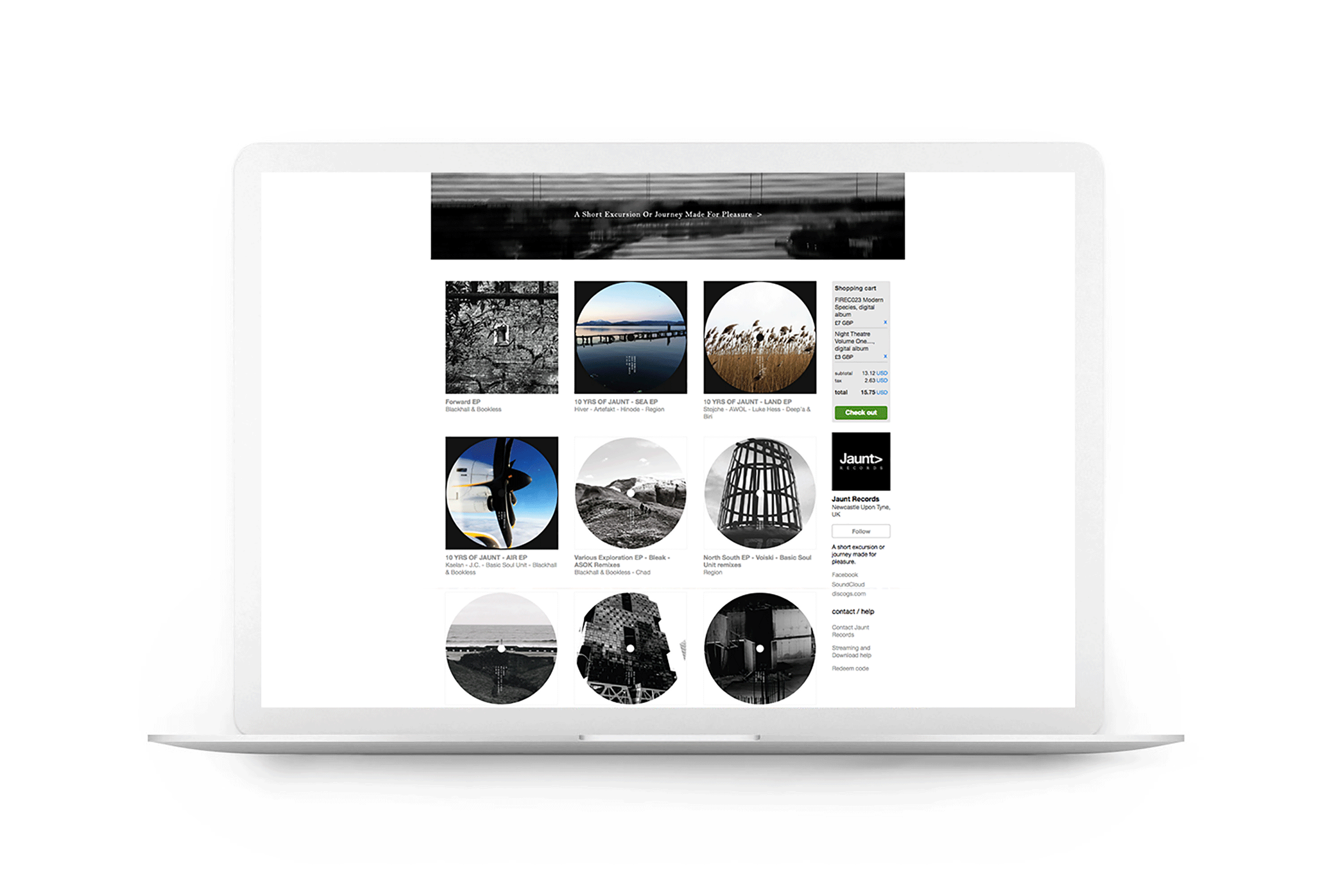
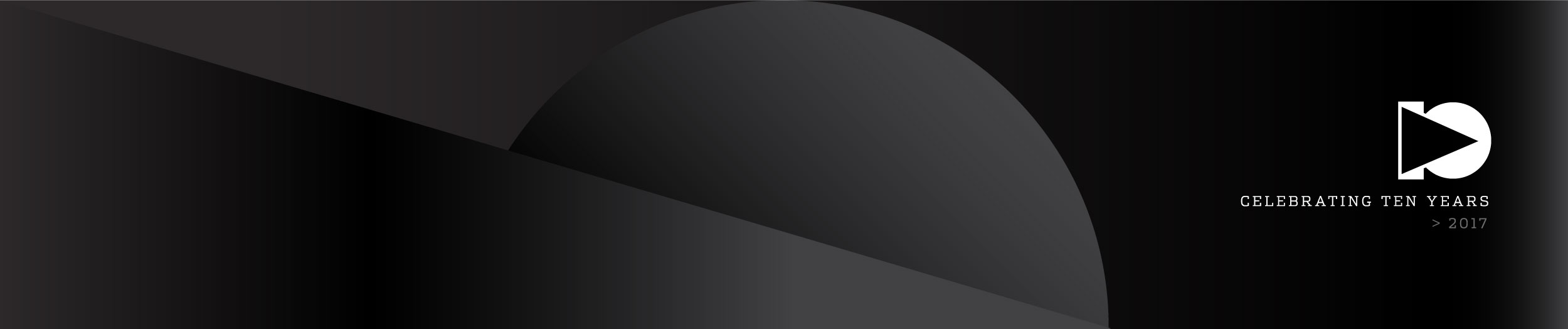
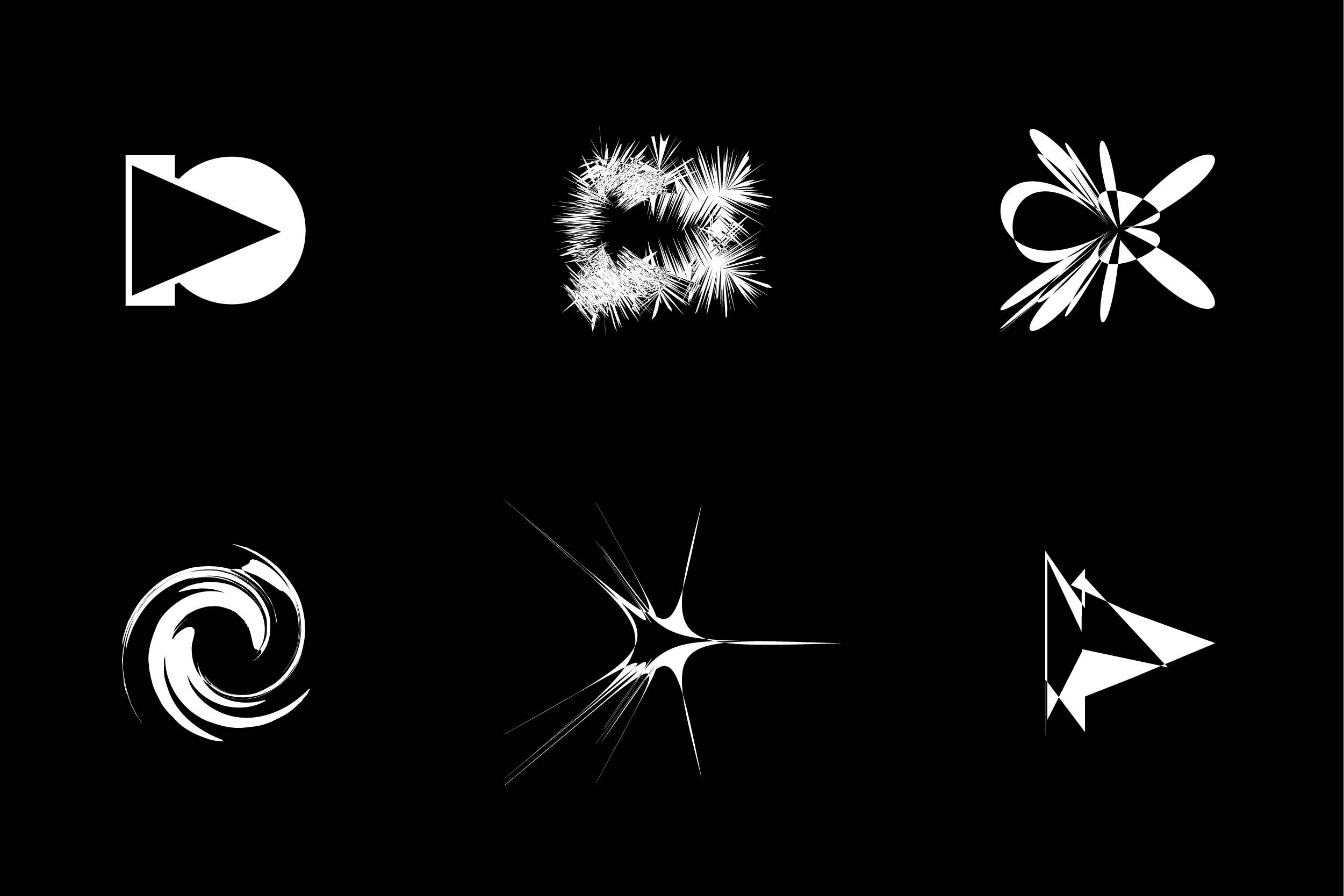
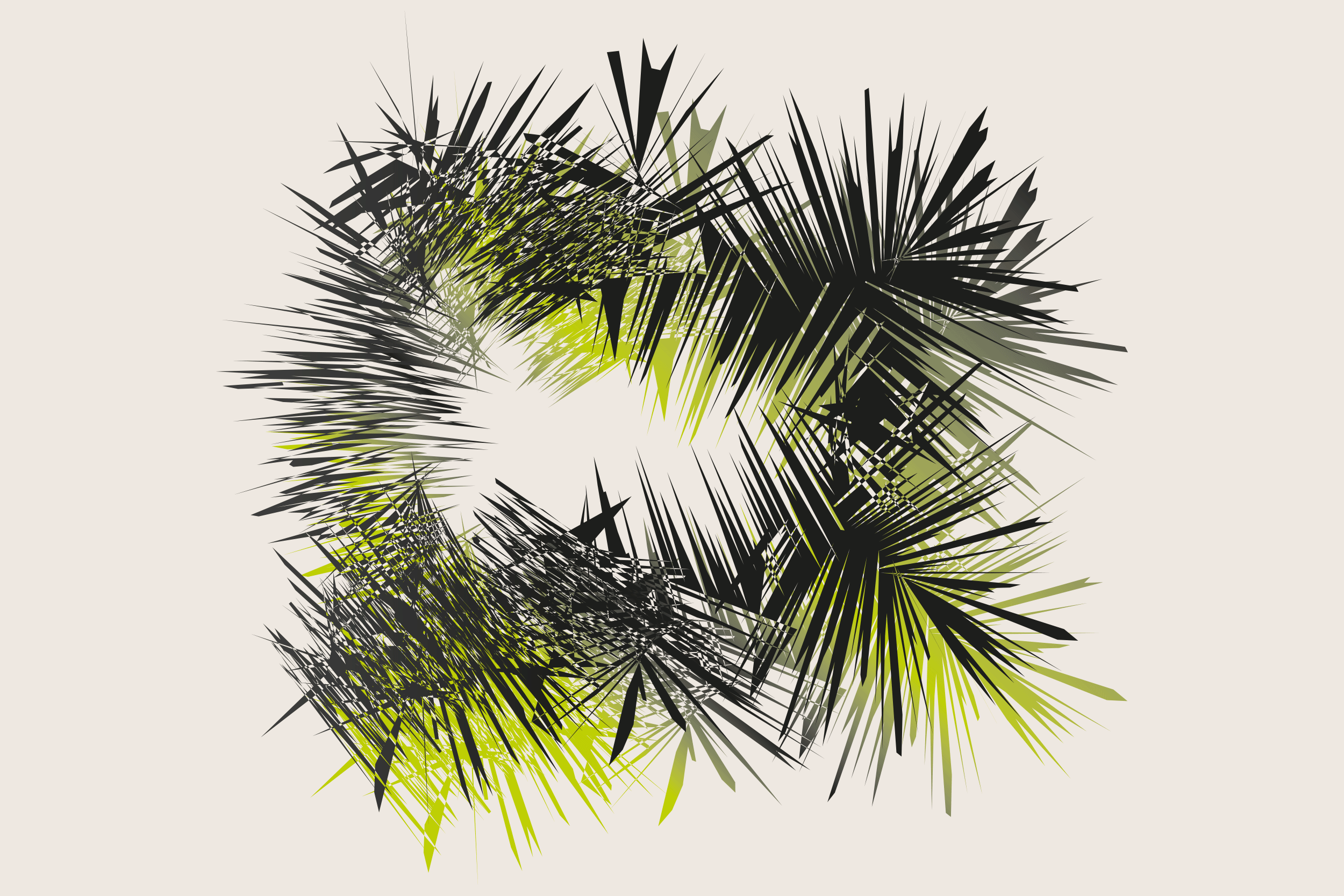
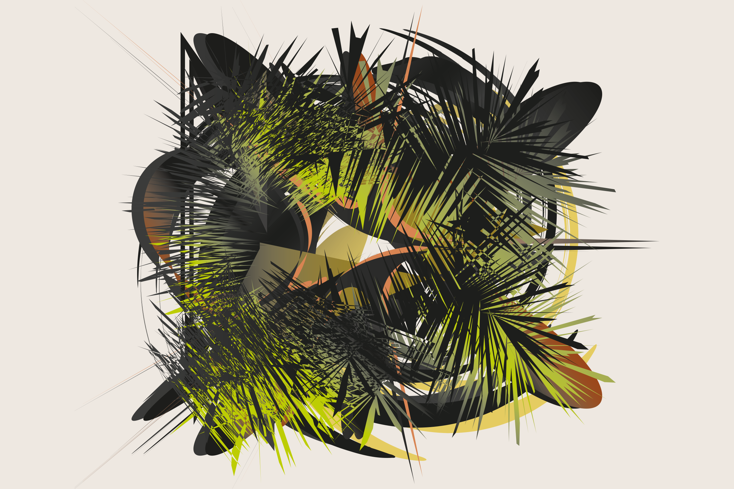
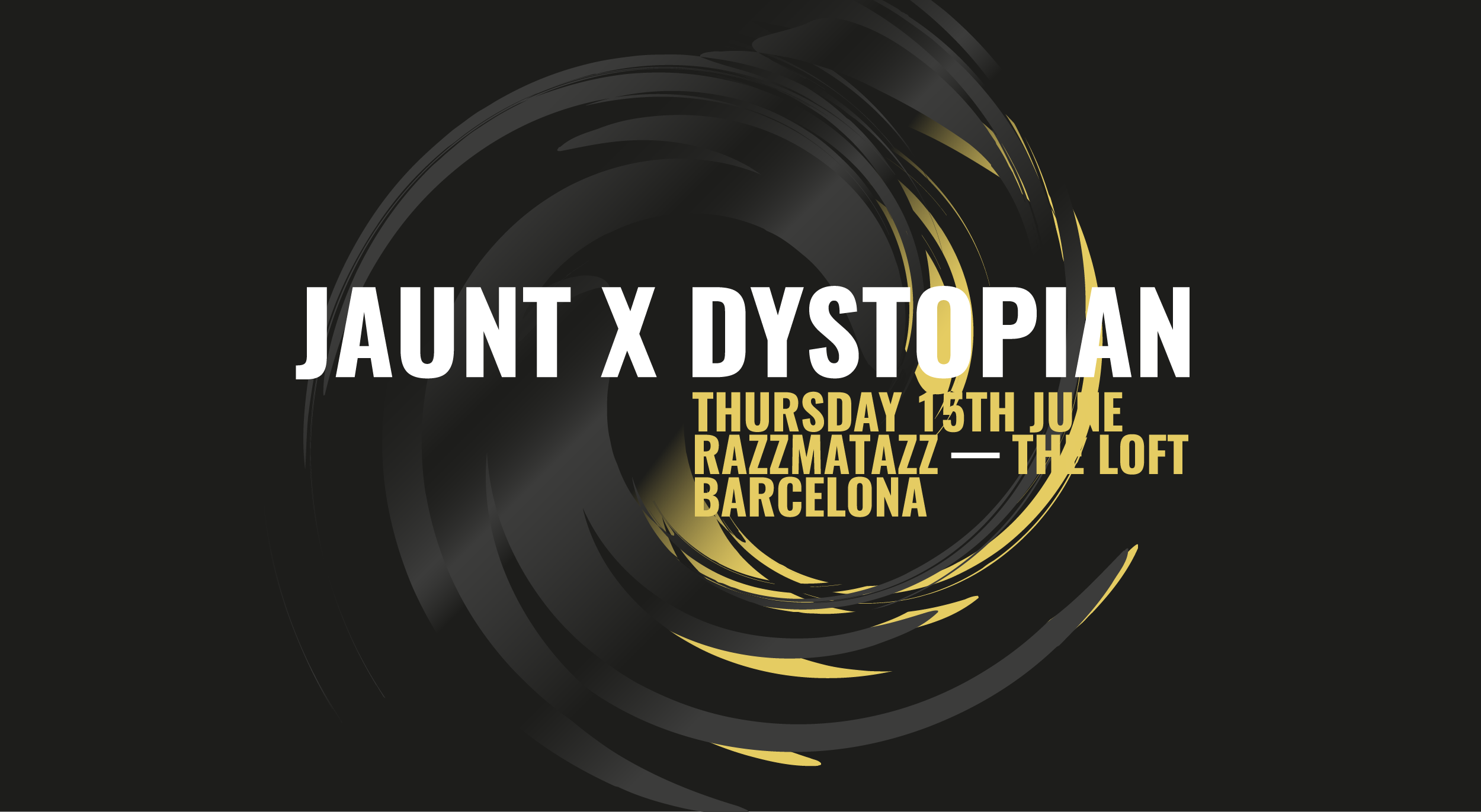
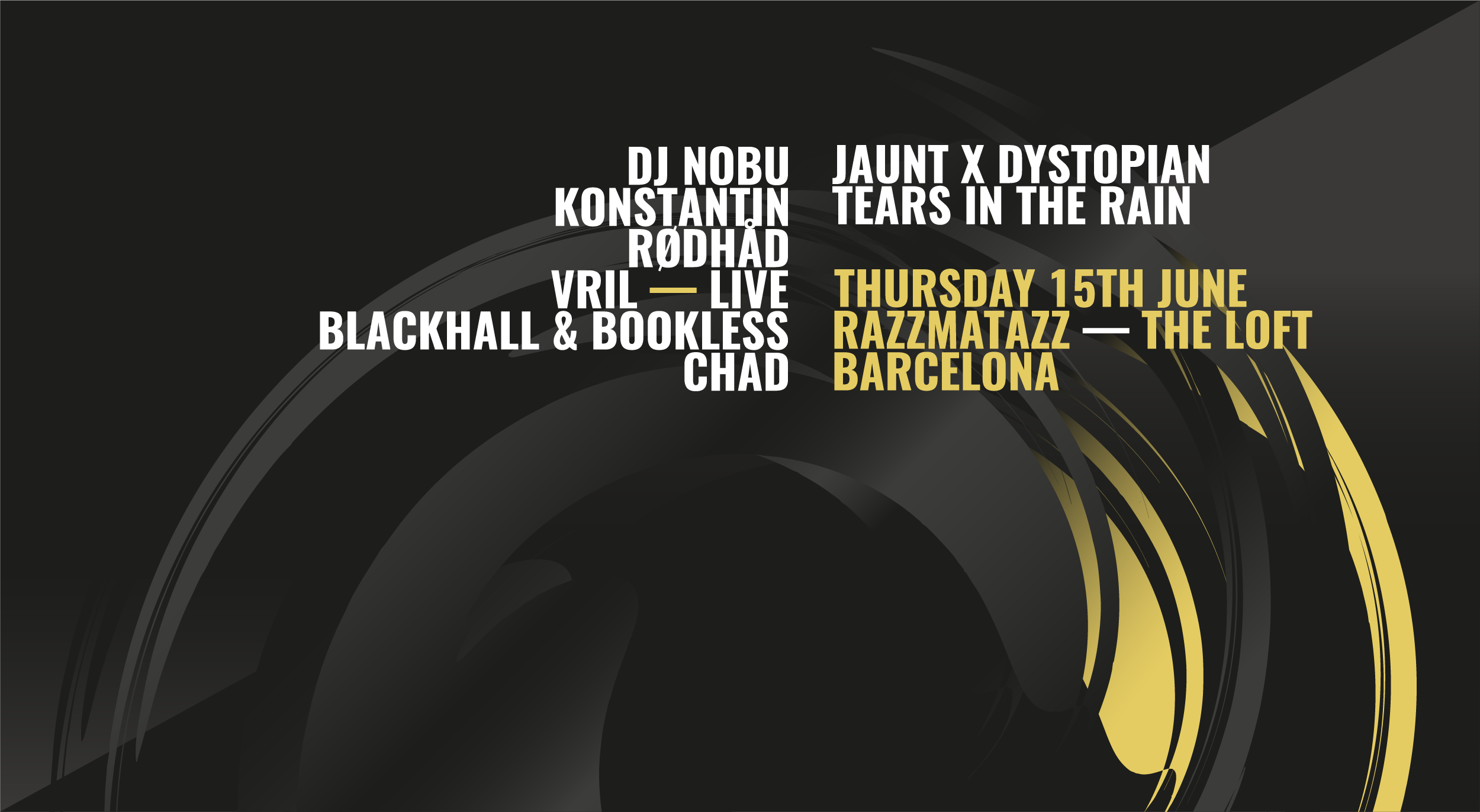
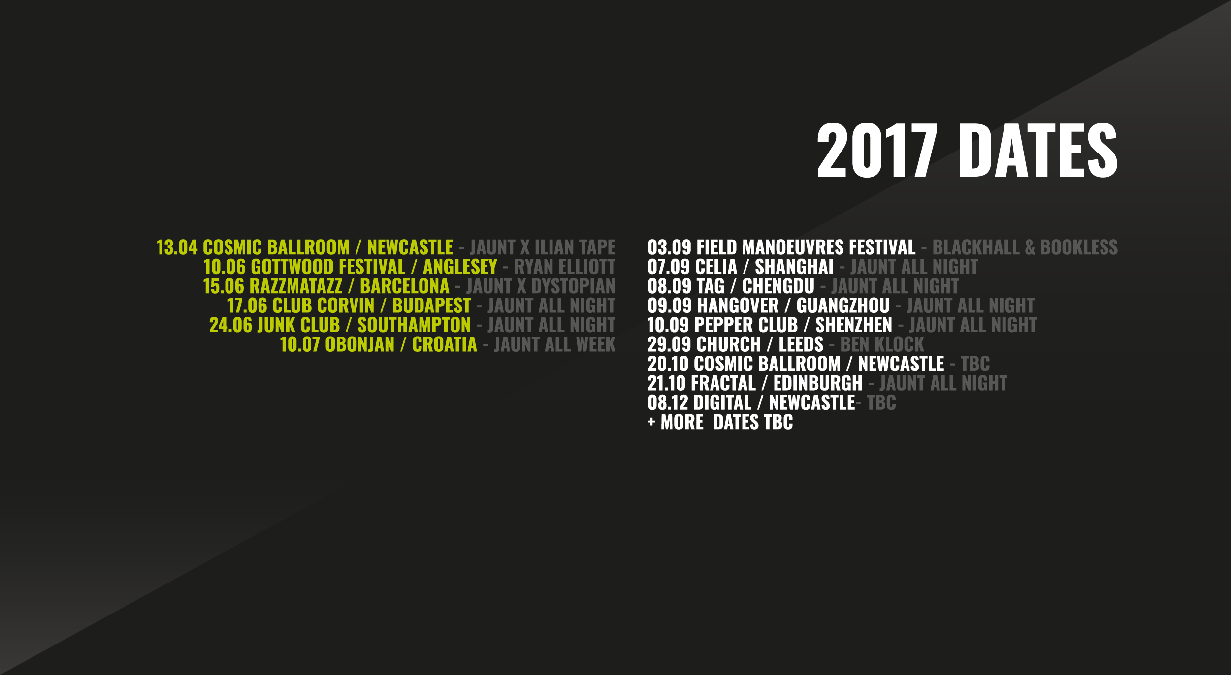
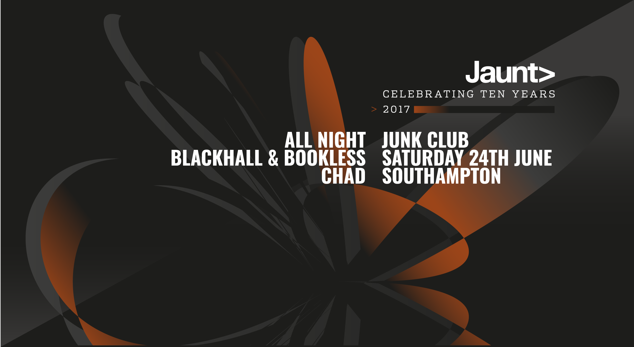
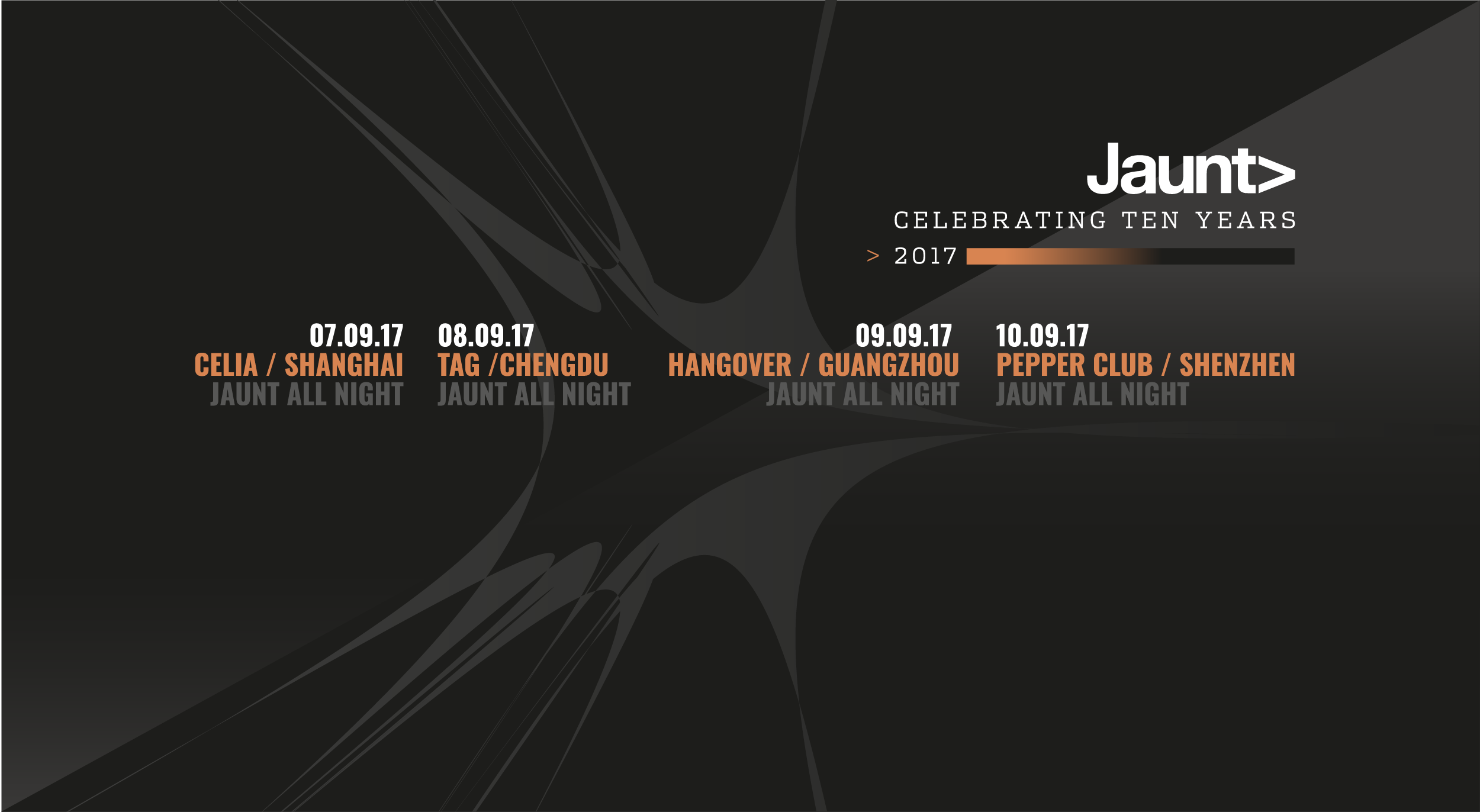
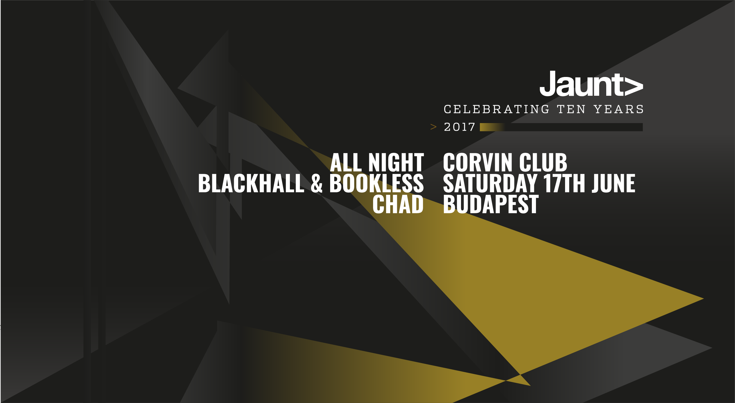
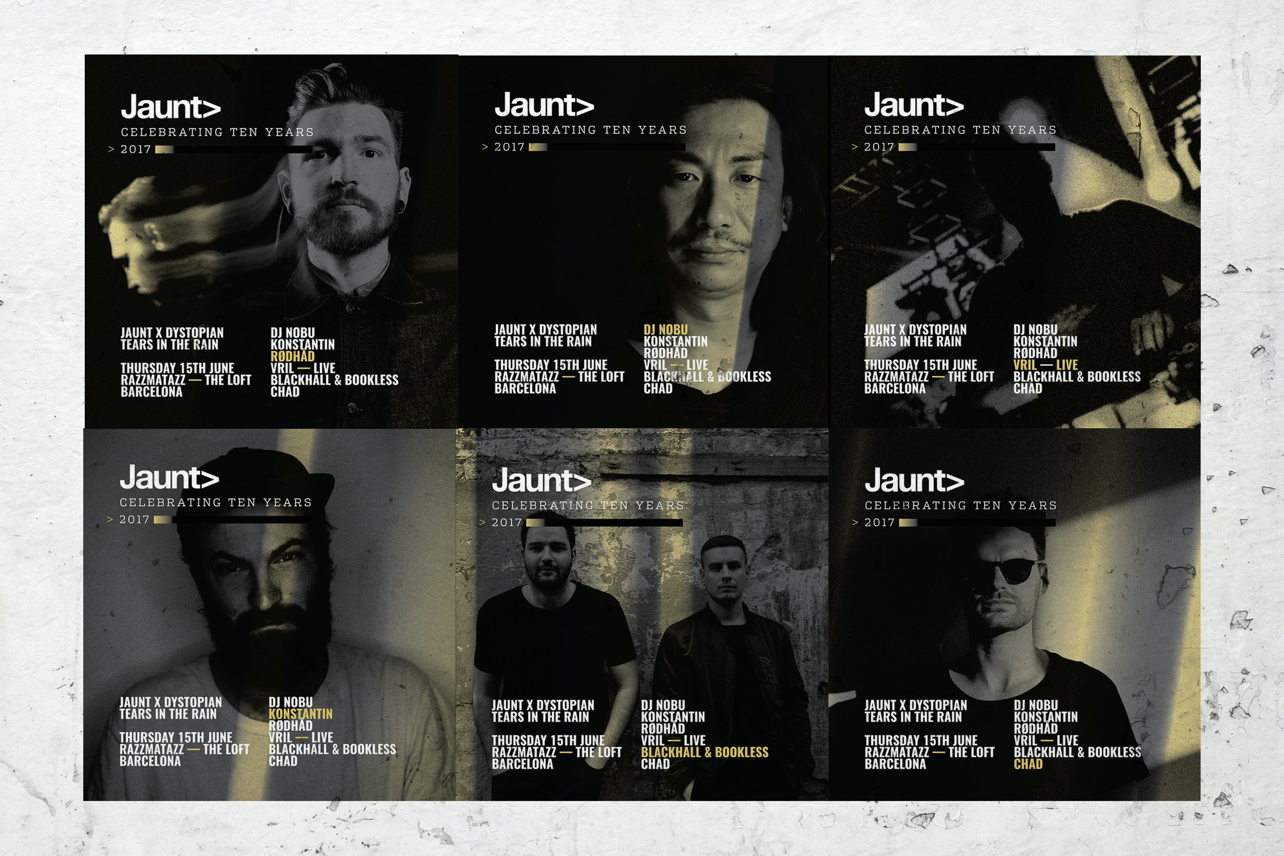
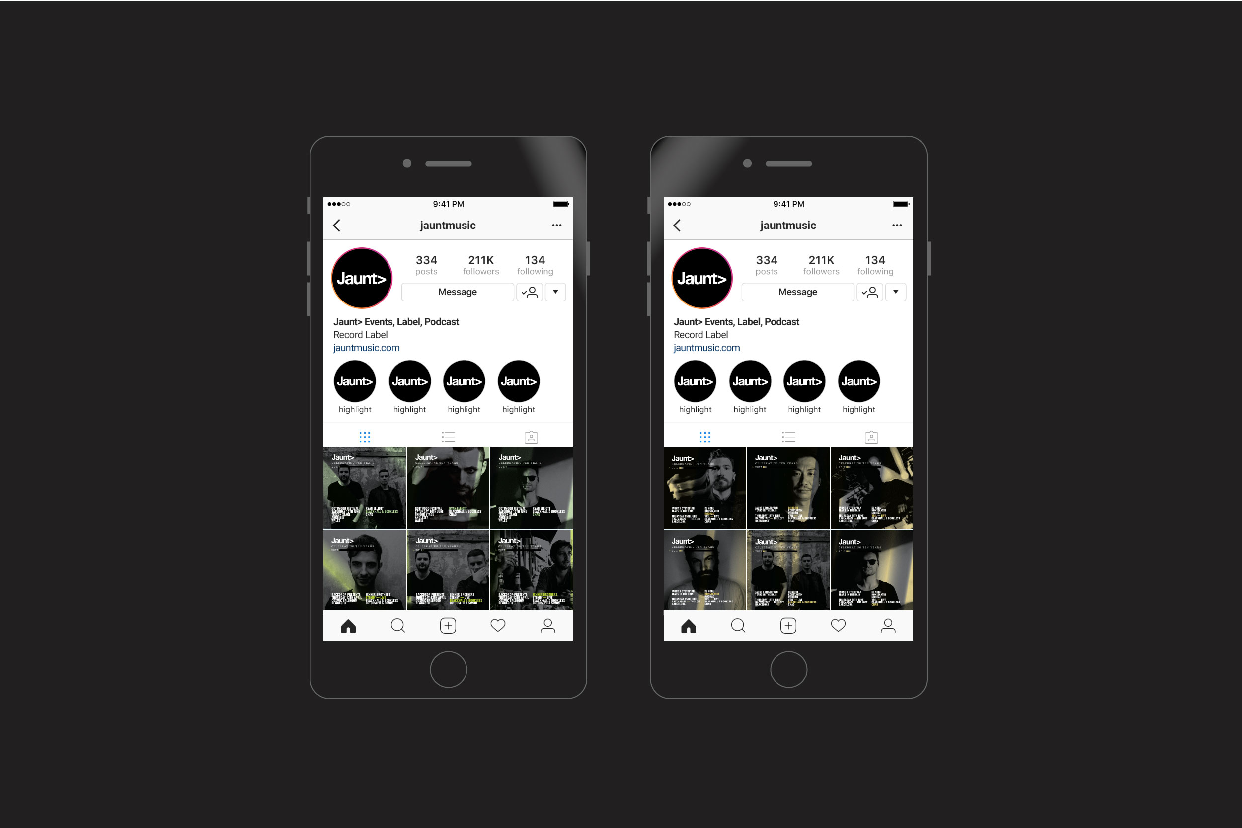
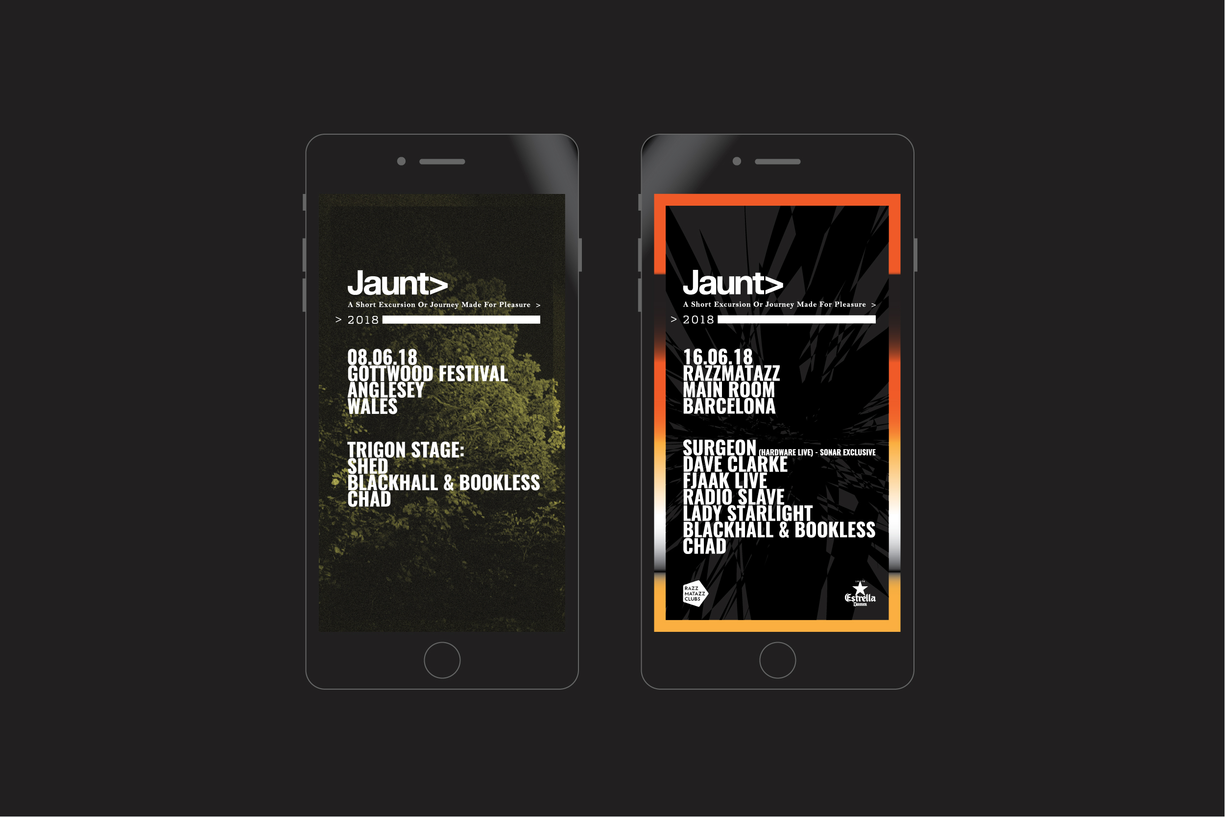
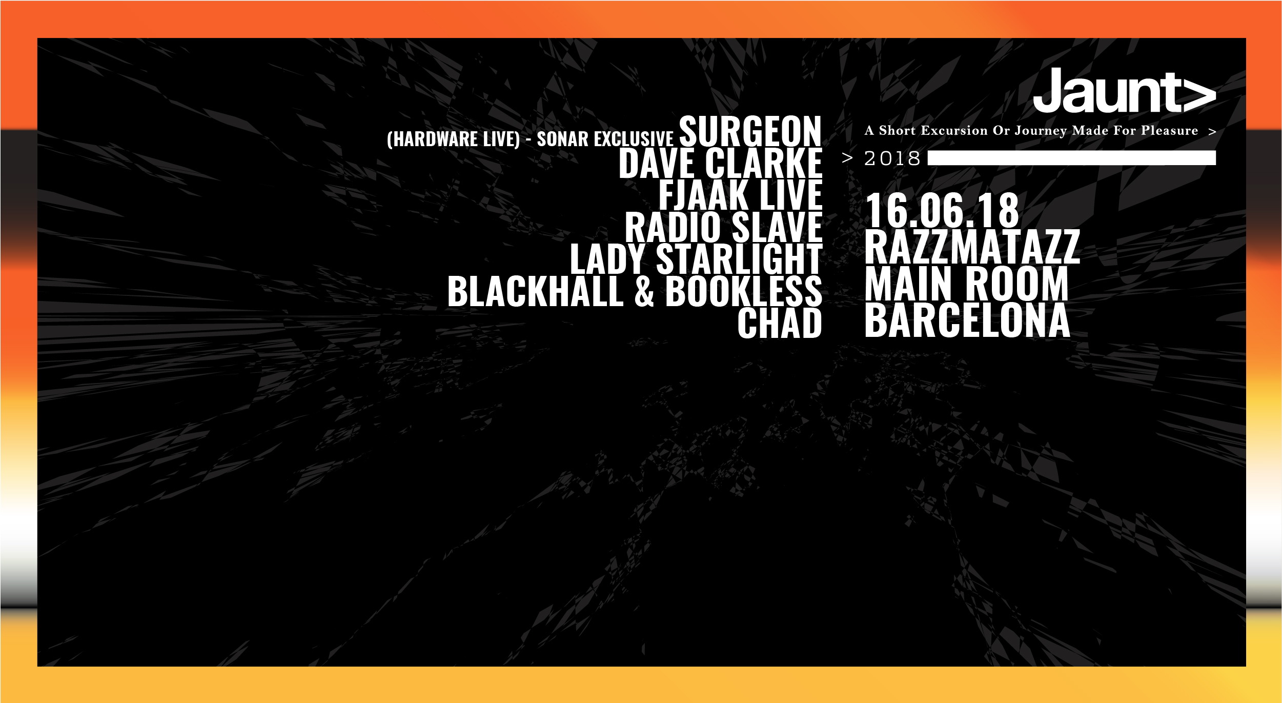
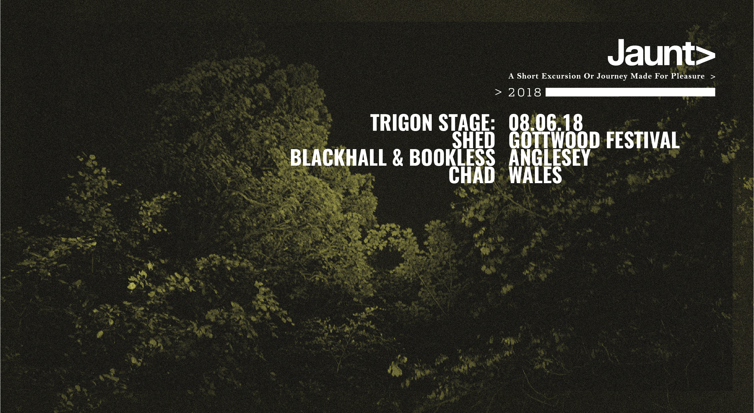
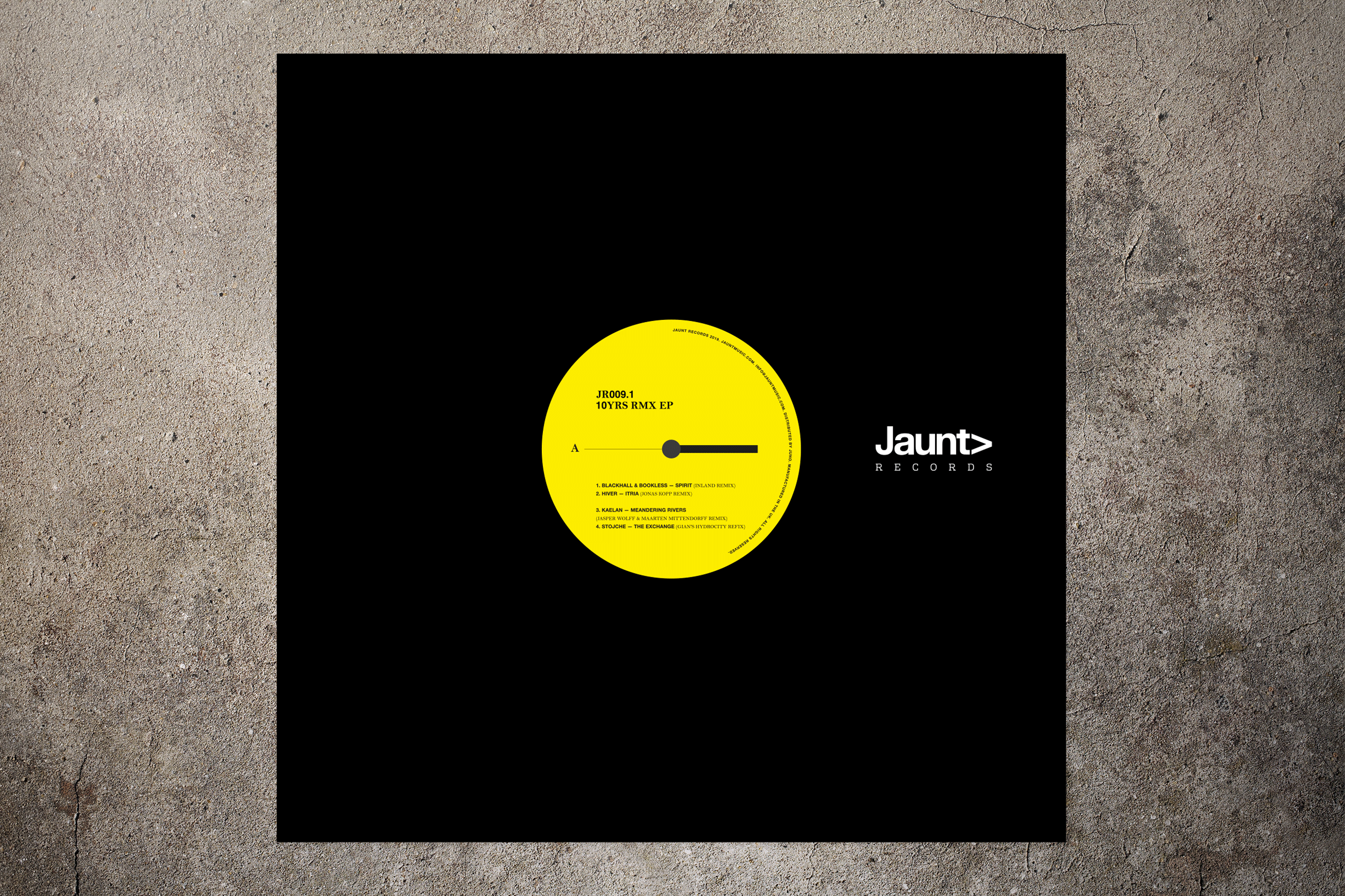
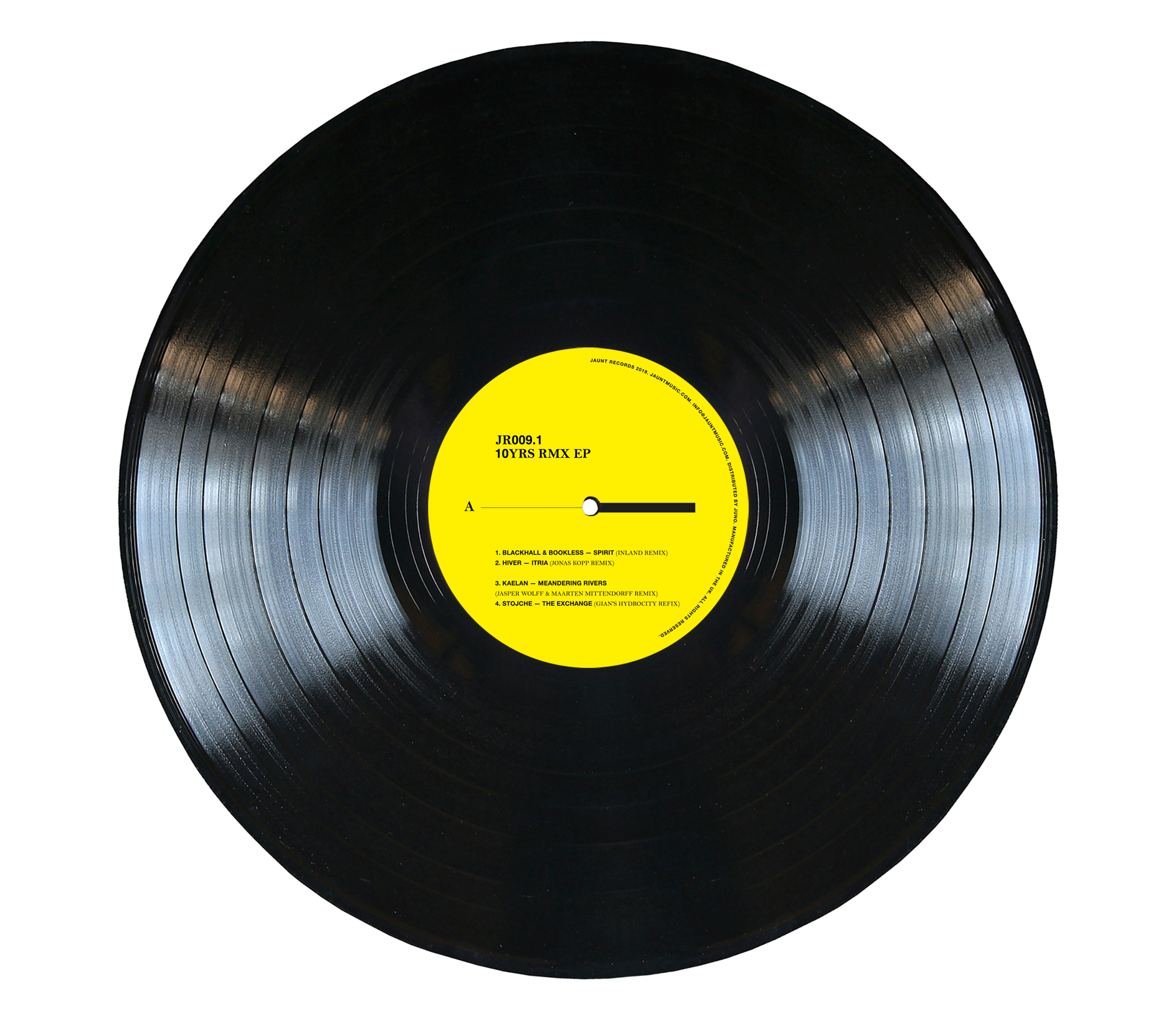
I established Jaunt in Newcastle 2007 along with some friends. We pride ourselves in a quality, authentic and DIY approach. Over the past 11 years we have grown into a UK clubbing institute and we still hold these core values to our events, mix series and record label. As Creative Director and Graphic Designer it has been a place for me to explore hidden ideas in my own playground, whilst pursuing infographics in an effective contemporary aesthetic. With the meaning of Jaunt in mind, the design has followed an ever-growing personal journey of development and stylistic exploration. There has been seasonal developments and changes throughout the event artwork whilst keeping consistency. The brand concept is to keep it clean and sustainable. The arrow is used throughout to symbolise moving forward, this graphical tool has been expressed in many forms. The record label was a chance for me to continue exploring in a different medium. A journey through the artists eyes. The B-side of each record features an image provided by the artist or a photographer of their choice to feature on the release, giving an insight into their own journey. This concept is to engage with the artists and bring a visual aspect, making it a documented jaunt in itself.
'Jaunt ’a short excursion or journey made for pleasure.’
I established Jaunt in Newcastle 2007 along with some friends. We pride ourselves in a quality, authentic and DIY approach. Over the past 11 years we have grown into a UK clubbing institute and we still hold these core values to our events, mix series and record label. As Creative Director and Graphic Designer it has been a place for me to explore hidden ideas in my own playground, whilst pursuing infographics in an effective contemporary aesthetic. With the meaning of Jaunt in mind, the design has followed an ever-growing personal journey of development and stylistic exploration. There has been seasonal developments and changes throughout the event artwork whilst keeping consistency. The brand concept is to keep clean and sustainable. The arrow is used throughout to symbolise moving forward, this graphical tool has been expressed in many forms. The record label was a chance for me to continue exploring in a different medium. A journey through the artists eyes. The B-side of each record features an image provided by the artist or a photographer of their choice to feature on the release, giving an insight into their own journey. This concept is to engage with the artists and bring a visual aspect, making it a documented jaunt in itself.