Client —
< Journey Never Steps >
Client —
< Journey Never Steps >
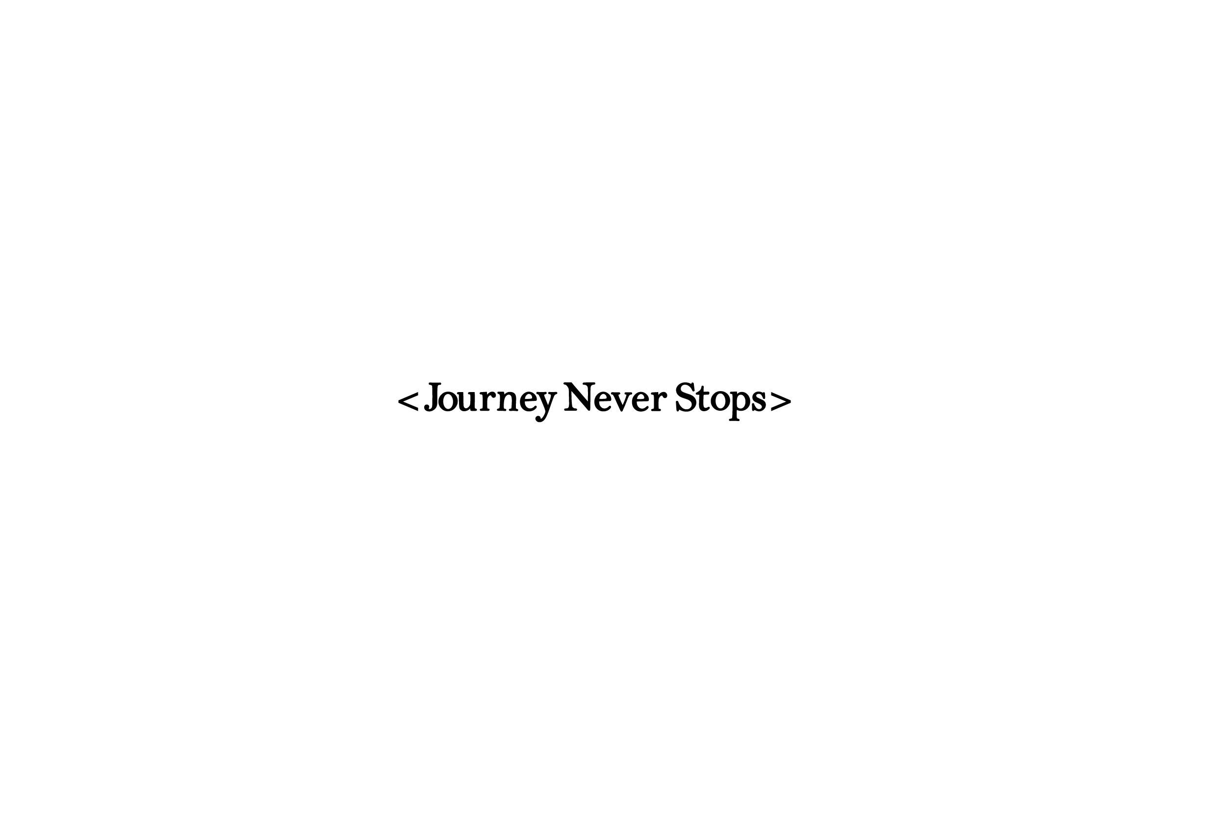
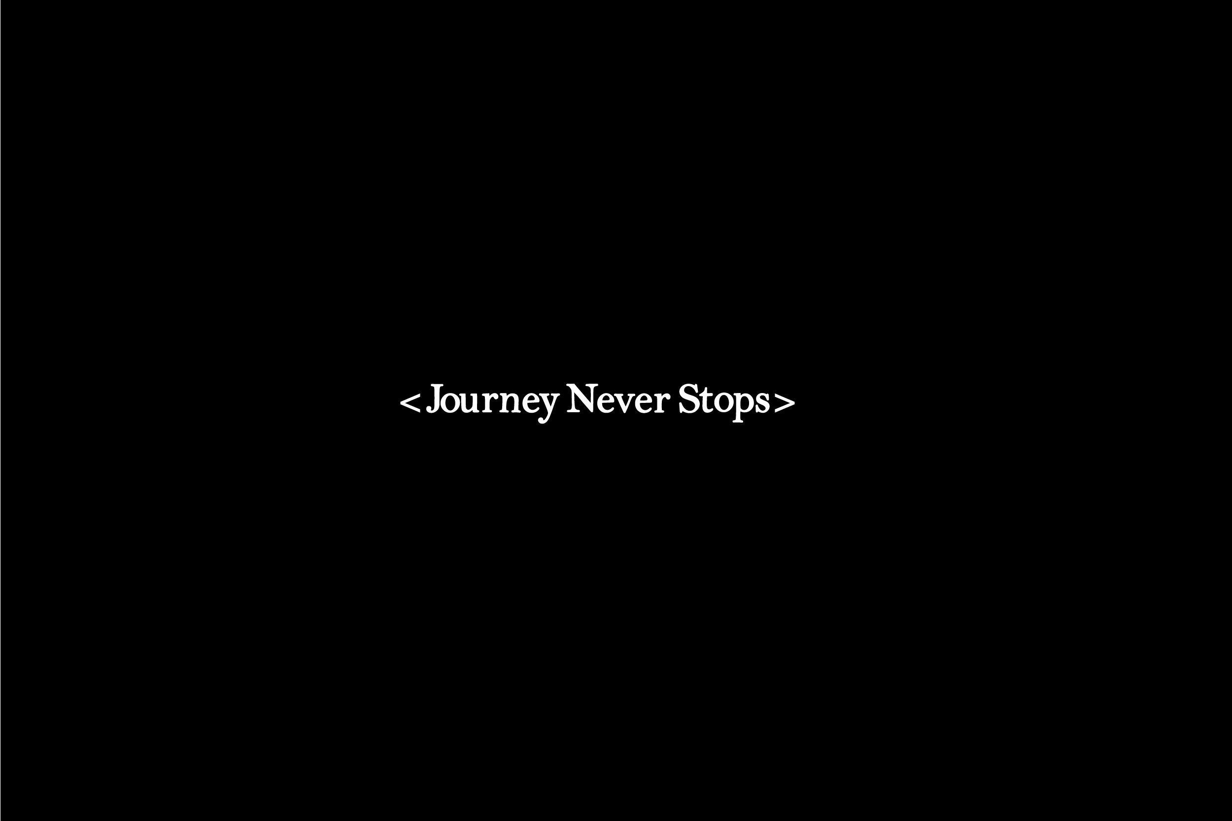
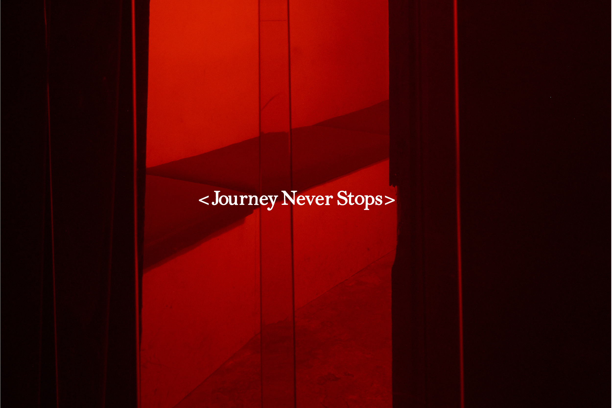
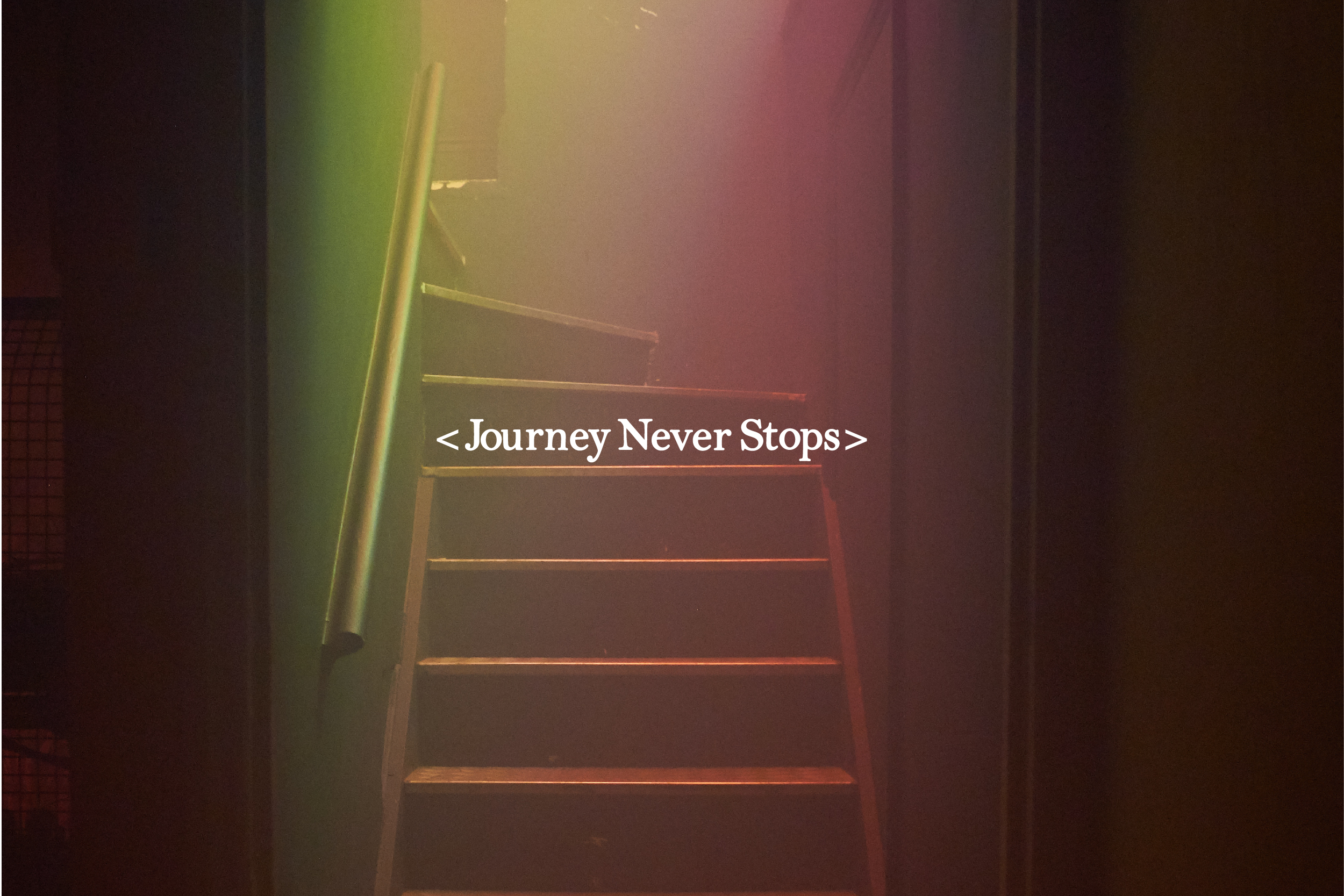
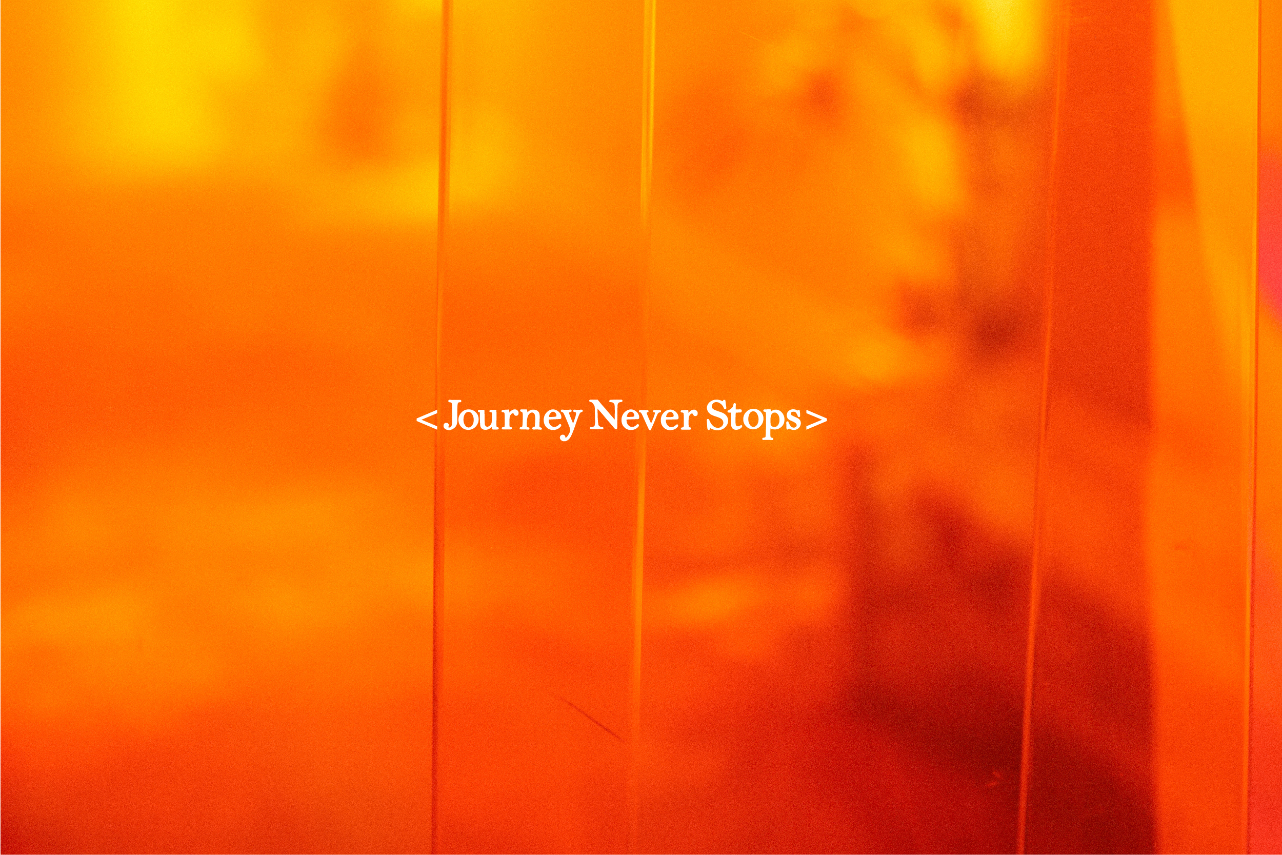
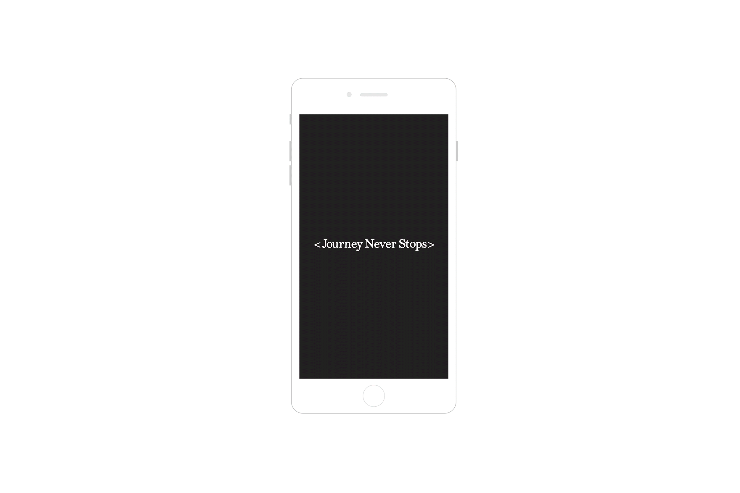
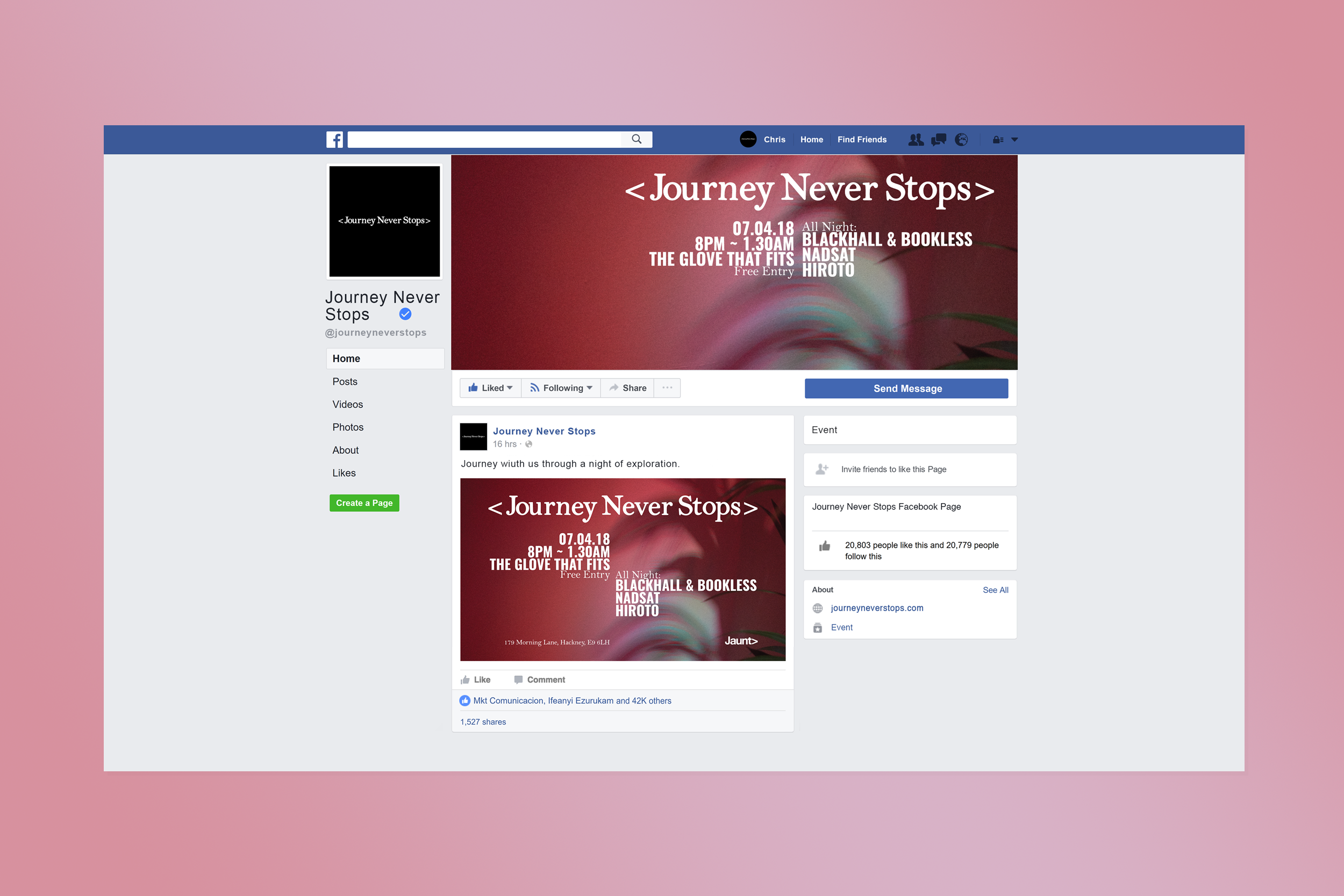
As an extension of the Jaunt brand I launched a new platform in the name of < Journey Never Stops > The platform will soon be a record label and regular event in London. The focus of this platform is to explore our passion for more eclectic and wider ranges of sound. I created a unique logotype which followed a more organic look and feel, moving the characters very slightly to design a stamp like aesthetic. As we are moving into our 11th year of Jaunt we wanted to express that our journey is ongoing, it does not stop, only evolves. The name has a fluid feel which will reflect the music and our vision for the project. To emphasis this concept I used 2 arrow marks in the branding.
As an extension of the Jaunt brand I launched a new platform in the name of < Journey Never Stops > The platform will soon be a record label and regular event in London. The focus of this platform is to explore our passion for more eclectic and wider ranges of sound. I created a unique logotype which followed a more organic look and feel, moving the characters very slightly to design a stamp like aesthetic. As we are moving into our 11th year of Jaunt we wanted to express that our journey is ongoing, it does not stop, only evolves. The name has a fluid feel which will reflect the music and our vision for the project. To emphasis this concept I used 2 arrow marks in the branding.